Showing posts with label fonts. Show all posts

Wednesday, July 07, 2010

Typo Chair


Dig the Typo Chair from designer Michael Bom. The abstract typographic Typo Chair is made from recycled billboards of Finnish Birch multiplex. Nice.

That's Right,

HMK

Friday, April 23, 2010

So You Need A Typeface


This might help expedite your next quick drive-thru design project! Smart stuff from Julian Hansen, a 22-year-old graphic design student from Copenhagen, Denmark.

Great job Julain, thanks for sharing!

That's Right,

HMK

I forget how where I originally stumbled upon this!

Sunday, March 14, 2010

Preserve


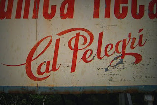
Preserve is on going project by Mark Spurgeonto of Australia. The goal of the project is to produce a permanent visual record of hand painted building signage in his native land. Sweet!

As Mark explains on the site, many of these signs are being erased from our cityscapes either being worn away by weather over time, covered as buildings have been repainted, disappearing as buildings are demolished or replaced with modern signage equivalents.

The Preserve site is updated regularly with Mark's latest images from New Zealand and Australia and you are invited to contribute to this work also.

Very cool, especially if you're a typography freak like I am!

Enjoy: Preserve!

That's Right,

HMK

Monday, February 01, 2010

World Wide Bakery: Calendar 2010


Nice promo for the World Wide Bakery - a calendar for 2010 via Agency: Futura2/2, Skopje, Macedonia.

That's Right,

HMK

Thanks to the smart folks at Inspire Me Now.

Wednesday, December 02, 2009

Get Yours Today!

Today is November 1st, 2008

Get yours today! The Perpetually Dayzed Calendar!

Back again for the first time - The Perpetually Dayzed Calendar!

Oh Yeah, Free Shipping!

That's Right,

HMK

Thursday, September 03, 2009

Stencil It In

The Sabas Trio
I love stencil fonts, always have. And according to Steven Heller, one of my favorite design gurus, stencil lettering never really went out of fashion, yet it’s coming back in style.


In the same way that booming martial rhythms have been incorporated into classical and popular music, stencil-lettering style has long influenced sophisticated typography and graphic design.

The top logo is something I did back in 2001 for the Sabas Trio featuring my friends Joe Reyes, Greg Norris and Mark Rubinstein. The District 9 poster is by Ignition Print and below is the poster and GUI for the iPhone app I did for the Rackspace Cloud Lounge Party. This was in collaboration with the wicked smart and cool folks at 2 Pixels + GetApp for SWSW this past March, 2009.

SXSW Rackspace Lounge Party Invite + Free iPhone App

Learn more about stencil fonts from Mr. Heller's latest design article for the New York Times: Stencil It In.

That's Right,

HMK

Steven Heller, a former art director at The New York Times, is a co-chair of the M.F.A. Design Department at the School of Visual Arts and a blogger and author.

Sunday, August 30, 2009

IKEA - WTF?


What The Font?

I just signed the IKEA, Ikea, Please Get Rid Of Verdana! Petition with this comment - you should too!

"C'mon IKEA, you guys are better than that! Verdana's a web font and dull as a fake Swiss Army Knife. Please stay classic and bring back Futura!"

More outrageous details: IKEA Sans replaced by Verdana.

Go sign it: Ikea, Please Get Rid Of Verdana! Petition.

That's Right,

HMK

Wednesday, August 26, 2009

Typedia


I just registered and activated my Typedia account, a brand-new community website with a nice Wikipedia-meets-IMDb approach that both classifies and tells you just about all you need to know about typefaces.

I'm really looking forward to diving into this site!

Typedia

That's Right,

HMK

Thanks to Swiss Miss

Monday, June 22, 2009

Custom Type Showcase

Nice. Letter Cult is featuring some of the best and brightest, so far anyway, hand tooled type of 2009.

Wojtex Polak

Geonetix

Sarah King

Nate Williams

BU Design

And yes, you are encouraged to submit your own examples!

Mucho Mas: Letter Cult

Happy Monday!

That's Right,

HMK

Thanks to the smart folks over at Under Consideration.

Tuesday, April 28, 2009

Hamilton Wood Type Printing Museum

The Hamilton Manufacturing Co. traces its roots back to the very first wood types made in the United States. Darius Wells produced the first American wood type in 1828; his business was reorganized into Wells & Webb, then acquired by William Page, later passing back to the Wells family, and finally sold to Hamilton sometime before 1880. The product of this consolidation was a type specimen book issued in 1900, Hamilton’s Catalogue No. 14, which offers a good survey of American display typography of the nineteenth century.


Open to the public is the Hamilton Wood Type Printing Museum in Two Rivers, Wisconsin, a collection of 1.5 million pieces of wood type maintained by volunteers of the Two Rivers Historical Society. For at-home viewing, the calendar printer Unicorn Graphics has just launched their Web Museum of Wood Types and Ornaments, which offers a sundry collection of scans and photographs of American wood types — including every page of the great Catalogue No. 14.

Wow, you can almost smell the ink!

That's Right,

HMK

Thanks to Hoefler & Frere-Jones

Tuesday, November 25, 2008

Design & Type Inspiration


If you're like me and you simply can't get enough inspirational eye candy focusing on all things typography and design then you'll truly dig the following links from fellow Flickr freaks David Airey and Vandelay Design.

Dig: 30 Inspiring Flickr Groups On Typography and 99 Flickr Groups for Design Inspiration.

StereoType

And while we're at it, here's some of my previous That's Right posts from the last 4 years regarding type and inspiration: That's Right: Type Inspiration.

Oh, and don't forget these! SignPaintr, Typeface Identification and International Typographic Style.

Enjoy!

That's Right,

HMK

Friday, November 07, 2008

Perpetual Eye Candy

Photo Flip Clock
I'm totally digging the wicked cool and customizable Photo Flip Clock! This sweet new iPhone app is from Larva Labs, the same smart creative folks that brought us the Flip Clock for the iPhone/Touch.

The only bummer is they beat me to the iPhone with basically the same idea as my HMK Perpetually Dayzed Calendar.

But Hot-Dang! I truly gotta say - they did one heck of a fine job, it's a very intuitive app and also, well, thanks! This really puts a fire under my butt to get jumping on some of my other iPhone ideas before some other genius beats me to it!

I hope they make a boatload for Christmas!

Meanwhile, back in the Tiki Room... I shot this this morning at exactly 10:53 on Friday, November 6th using a few of the cards I developed for my HMK Perpetually Dayzed Calendar available at Esty. Think of it as the tangible version of the app... And hey, it really makes great gift for all the hip retro loving kids on your list!

Get The Calendar: HMK Perpetually Dayzed Calendar

Get The App: Photo Flip Clock

That's Right,

HMK

Saturday, July 05, 2008

Liverpool Letterpool News


Yeah, Yeah, Yeah!

Letterpool is a community art project showcasing examples of glorious typography in and around Liverpool from modern day, dating back to the eighteenth century and beyond. We are calling for entries from the people of Liverpool to send in photographs of your favourite examples of type, ranging from funky and artistic to commercial and industrial.

Many of the photos will be shown on the Letterpool web site and 100 of the best will make it into a hardback book to be published at the end of this year.

Dig it: Letterpool.

And speaking of liverpool... For 44 years a canister of film had been stored in a damp garage in South London; unopened, unloved and almost thrown away.
But, finally, somebody took a look inside - and realised they had unearthed a piece of pop history.

This is the story of a lost Beatles interview, produced by Howard Shannon - which is to be broadcast on BBC Radio 4 on Tuesday for the first time since it was originally recorded.

The nine-minute interview took place in the studios of Scottish Television on Thursday, 30 April, 1964 and airs at on Tuesday 1 July, and again at on Saturday 5 July, check out BBC for more info.

And who knows, you might just might find it here over at Necessito La Music...

That's Right,

HMK

Thanks to Digital Thread.

Friday, June 27, 2008

Type Tester


Lorem ipsum dolor sit amet, consectetuer adipiscing elit. Typetester lacus felis, euismod at, pulvinar sit amet, dapibus eu, eros. Etiam tellus. Nam vestibulum porttitor urna. Phasellus aliquet pretium quam. Proin pharetra, wisi nec tristique accumsan, magna sapien pulvinar purus, vel hendrerit ipsum tellus at ante.

Typetester is an online application for comparison of the fonts for the screen, specifically designed to make the life of any web designer easier.

So, if you have anything to do with designing for the web you'll appreciate Typetester.

That's Right,

HMK

Saturday, May 31, 2008

Absolutely Smashing Type Inspiration

Cerveza Corona Extra
This one is for all my fellow typography freaks - the smart folks over at Smashing Magazine have compiled a killer post showcasing over 70 examples of sexy, bold and experimental typography.

Dig: Sexy, Bold and Experimental Typography.

And these flikr pools don't suck: Signpaintr, a pool of images dedicated to the lost art of sign painting and hand-drawn lettering and Typography and Lettering feaures letters made my machine or man.

Cheers and have a great weekend!

That's Right

HMK

Thursday, March 27, 2008

ABC3D


Very nice. I think one of the coolest things about the ABC3D book is that you can get you very own copy over here!.

That's Right,

HMK
Thanks to my buddy Todd Morey over at: Mosso.

Monday, March 03, 2008

Saturday, January 19, 2008

Vintage Typewriter Ribbon Tins +


Janine Vangool, from the smart group of folks over at Uppercase Journal out of Calgary is sharing a super nice flickr from her collection of vintage typewriter ribbon tins.

You can check them out over here. And oh yeah, while we're on the subject of sharing and nice, informative sites, dig this y'all: Graphic Exchange


That's Right,

HMK

Tuesday, January 08, 2008

Gallery of Book Trade Labels


Ahhh. Fresh coffee and two of my favorite things: Books and design with typography. Enjoy this great little collection of Book Trade Labels from publishers, printers, binders, importers, distributors and sellers of books new, second-hand and antiquarian.

Above: O. Henry Book Store, San Antonio, Texas, Bean's Stationery and News Depot, Bangor, Maine and E. Broekhuis & Zonen Boek & Kunsthandel, Boekbinderij
Hengelo [Overijssel], Netherlands.

All courtesy of Greg Kindall's Seven Roads

That's Right,

HMK

Monday, March 05, 2007

Bursting With Fonts


Looking for better font Management? So am I.

I found a great springboard for all of us with an ever growing font collection: Font Management

Thant's Right,

HMK

Thanks to Joel Sacks. Joel at UrbanFonts. He knows quite a bit about fonts and font management - UrbanFonts.com features over 8,000 free font typefaces. Originally from South Africa, Joel currently lives in Canada.