Tuesday, April 18, 2006

Guaranteed Porcelain Skin


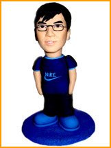
In the past, only celebrities had their own ceramic dolls. Now, you can have your own customize ceramic doll and enjoy the privilege that celebrities have. Create your own ceramic doll today and welcome to the world of ceramic.


Click Here.

Sweet...

HMK

Sunday, April 16, 2006

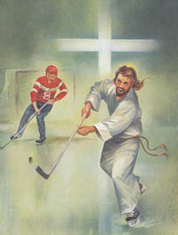
For The Love Of Christ


Talk about High Sticking...

I know, I know, I might be skating on thin ice for posting this but c'mon y'all, after all, God did invent the sense of humor, right?

Please forgive me and check out J2K6.

Hey, what do Hockey and J.C. have in common? They both came back from the dead...

(Insert your own bad JC joke in the comments section)

That's Right,

HMK

Thursday, April 13, 2006

Happy Easter!

Ahem, Anthem?

I found this and I'm just not sure if it's a good or a bad thing. To me, I guess it all boils down to concept, execution and appropriatness... I'm thinking it might just be a joke...

Here's the deal as they describe it:

An eNthem, is a revolutionary new project, that's hoping it will change the business world forever!

A more narrow definition on an eNthem, would be - a Company Anthem, an Official Company Song.

It's not a secret, that each and every nation, has their own anthem! A national anthem, is a special song, that is the heart and sole of each and every nation. A song, that reflects nation's identity and everything the nation believes in, it's self, unity, devotion and loyalty, as well as expresses all the great values of the nation.

Well, just like each and every nation has an official national anthem, we believe, so should each and every company have an official eNthem!

Decide for yourself at the eNthem site...

Not sure if That's Right...

HMK

Not That Teddy!


Not Kennedy, but Roosevelt!

Some interesting ideas on Immigrants and being an
American via Theodore Roosevelt in 1907.

"In the first place, we should insist that if the immigrant who comes here in good faith becomes an American and assimilates himself to us, he shall be treated on an exact equality with everyone else, for it is an outrage to discriminate against any such man because of creed, or birthplace, or origin.

But this is predicated upon the person's becoming in every facet an
American, and nothing but an American...There can be
no divided allegiance here.

Any man who says he is an American, but something else also, isn't an American at all.

We have room for but one flag, the American flag. We have room for but one language here, and that is the English language, and we have room for but one sole loyalty and that is a loyalty to the American people."

Theodore Roosevelt 1907

Five Quick Questions

5 Quick Questions Answered by Kevin Farnham, CEO, Method

Kevin Farnham heads Method, a San Francisco-based design company that helps marketers cultivate interface-design innovation, a critical part of brand building. An interface is any time the consumer is experiencing the brand-specifically, screen-based interactions via smart phones, mobile phones, hand-held devices, TV set-top boxes and DVRs.

Define interface-design innovation.

What we're really looking at are the new ways in which companies can speak to consumers. What we're seeing is an incredible opportunity at the interface level. What comes along with that is the ability to tell stories, be emotive, be transparent.

Why should CMOs care about this?

It's an opportunity to upsell and cross-sell, an opportunity to provide great experiences for customers. There are financial implications and brand implications.

In what way is it a component of brand-building?

Like any other touch point, these interfaces are an opportunity for someone to have a brand impression. If you look at this in comparison to a brochure, these touch points have so much more potential to be more entertaining, visual, engaging.

Should all marketers create new interfaces to use to reach consumers?

They need to utilize design thinking even if they're not using outside consultancies. Bring the engineers, bring the marketers, bring the CEO, think about scenarios for your customers, think about who they are and what they need.

Do all interfaces lend themselves to good design? Cellphones? ATMs? Web sites?

Good design can be implemented in a lot of different ways. If you're FedEx, you want things that are incredibly catered to your workflow. There are other interfaces where the point is you want to let customers get the information they want ASAP.

Thanks to Ad Age

Wednesday, April 12, 2006

Not Baaaaahd.


Who needs popup ads and banner ads all over the place when you can just slap a jacket on a sheep and call it good? These hotel-supporting sheep showed up in the Netherlands.

That's Right,
HMK

Thursday, April 06, 2006

Cheap TV Ads That Look Pricey


Local TV advertising has a bad rap. "I had visions of cheap, awful, late-night cable access commercials with really bad production values,'' says Brad Kriser, owner of The Barking Lot, a 15-employee dog-care facility in Chicago with $2.3 million in annual sales.

It doesn't have to be that way. Spot Runner, a Los Angeles startup, is offering entrepreneurs ready-made ads they can customize, then air locally. For two weeks in November, Kriser gave it a try, running 30-second ads 144 times on networks including ABC Family, Lifetime, and Animal Planet, all in his local market.
While his ad didn't look cheap, it came cheap, considering the results. In the three weeks during and immediately after his campaign, calls to The Barking Lot were up 20% to 30%. Kriser received a discount for participating in Spot Runner's pilot program, but without it, the ads would have cost him $1,700.
While the advent of local cable operators has made airtime more reasonably priced, the legwork involved in placing ads has been enough to deter many business owners. That's on top of the steep production costs, often tens of thousands of dollars, required to produce high-quality ads.

Spot Runner is so cheap in part because it has moved that process online. The company maintains an online library of thousands of industry-specific 30-second spots that can be customized with a client's own narration, contact information, and logo for $350 to $500. Prices include limited-time exclusivity to keep competitors from running the same commercial in the same market. Extended exclusivity periods are available for a fee.

The next steps are to choose a budget, decide how long you want the ad to run, and select one of three objectives: awareness, limited-time promotion, or call to action. Spot Runner then generates an ad schedule based on built-in demographic assumptions about your industry. You can tweak it by adding or removing channels, changing the number of times an ad runs on a particular channel, or altering the time of day an ad runs. The whole process takes about 10 days.

Not all broadcast markets are equally accessible. Local cable service providers determine the availability of networks and time slots. There tend to be plenty of options for big cities, but smaller markets such as Eugene, Ore., and Madison, Wis., offer only a handful of local channels.

Of course, rates and time windows vary widely between markets. An ad running during CNN's Headline News in Manhattan, Brooklyn, and Queens costs from $188 to $282. The same ad runs on CNN Headline News in North Dallas for $8 to $9 a pop. A small price to pay, says Kriser, to look like one of the big dogs.

Thanks to Small Biz Week

Wednesday, April 05, 2006

Office Life


As the recent success of NBC's "The Office" shows, the trials and tribulations of office life have become more popular than ever. But what is it about today's work environment that provides such fodder for comedy?

We spoke with Michael Malice and S. Morgan Friedman, creators of Overhear At The Office, about the travails of working in an office these days, and why humor makes an effective coping mechanism for everyday job stress.


Q: How does your site work?

Michael Malice: It's not very complicated. People hear things in offices, in their cubicles, all the time, and they send them in to us, and we put it up. And everyone can share their pain.

Q: So what's the purpose?

S. Morgan Friedman: The purpose is to share the experience of what it is like to work in an office environment, with a particular focus on the dynamics between the different people. How bosses talk to everyone, and how ridiculous they sound from the outside.

Malice: I think it also gives you the sense of people having to bite their tongue while surrounded by idiocy.

Q: Is that what lends humor to office life?

Malice: The major subtext is an extreme level of irony. The person in the front of the room often does not have the right or the ability to be at the front of the room. The other level of irony is that they think they do deserve it. It is several steps removed from reality, where this person should be a janitor, but because they have a fancy office and are dressed a certain way, somehow they think their head isn't up their ass. I think that's what strikes a chord with people.

Friedman: It's not just the bosses. A lot of the humor comes from the way everyone in the office deals with it. For example, a VP says to an IT guy, "Have you installed Google on my computer yet?" And the IT guy responds, "Just yesterday." The humor from that comes not just from the boss not knowing that Google doesn't need to be installed, but the IT guy who doesn't want to deal with the problem.

Malice: What's funny is that it is a very universal story. Every IT guy on Earth has a story of dealing with a higher-up who asks a stupid question, and they just smile and give an answer just to shut them up. This is happening right now, somewhere -- I guarantee it.

Q: So sharing such office humor is a good coping mechanism?

Malice: Overheard in the Office updates 9 to 5, hourly, because I remember what it's like being a temp and staring at the clock and doing the math -- I got two hours and 20 minutes left. It's our way to help pass the monotony. Because, in many ways, an office job is like a prison sentence: the boredom, the lack of freedom, the complete sense of helplessness, the rape. Well, not so much the rape, but the rest.

Q: Is office life still a problem? Are people not finding the balance they want?

Malice: It works both ways. I think a lot of people are stupid and have no ideas of their own. So a job where they are put in a box and told what to do is something that many people need.

Q: What makes for the funniest material?

Malice: Anything that is popular on the site, that resonates, is going to work on several levels. On the simplest level, it's funny. The second level is the sociological level, that it gives you and encapsulates the experience of being in the universal office. And the third level is the subversive level, where it is undermining this whole hierarchical authority structure. This is all philosophical fancy -- it's just a fun site. I don't think either of us would be comfortable saying why person X finds the site interesting. We're just glad that so many people do.

Q: Why does office humor remain popular?

Friedman: It is something everyone can relate to. And when you are in the middle of a crazy situation, you sense that it is crazy. But when your boss is yelling at you, you don't have much of a choice and you think, "Am I the crazy one?" It's knowing that it's not just me, that every office in the entire world has these same dynamics. It makes it more bearable for everyone.

Malice: A lot of people bash high school and say, "You're not in high school anymore." But in school there is pressure to conform and to not be a freak. But once you are the boss, you kind of let it all hang out. That sense of shame is gone and you can say things that no one with any decency should be saying. And with a complete lack of awareness. Or with awareness. Either way, it is F-ed up.

Q: Do you have a favorite office joke or anecdote to share?

Friedman: That Google one is my personal favorite.

Malice: We had one that just ran. Two suits are at the bathroom, at the urinals. The first one goes, "I'm going home for the day, take care. You have a good one." And the second one goes, "Thanks, I didn't know you were looking."

Thanks to Kevin Ohannessian

Tuesday, April 04, 2006

My Thang TV


You may have heard about YouTube and the viral video craze that’s become one of the hottest Internet trends since the birth of social networking sites. Two major viral video portals you may not know of yet are Channel 101 and Channel 102. Think of these sites as the localized, viral video equivalents to American Idol. Here’s how it works: anyone can submit a TV show pilot (up to five minutes long). Every month the shows are screened for live audiences in Los Angeles (Channel 101) and New York (Channel 102), and viewers can vote on which shows to renew and which shows to cancel. The top five shows then become the “prime time” lineup, while the losing shows are cancelled forever. At the next month’s viewing, the prime time shows test new episodes against a new selection of pilots, and so on.

Currently, the biggest success story is a series called Yacht Rock, that’s become an underground hit with over 300,000 downloads. Created by four clever Michigan natives, the satirical comedy pays homage to a different smooth sounding late ‘70s/early‘80s track (think Hall and Oates, Doobie Brothers, Kenny Loggins, etc.) each episode. The show has become so popular that the term “yacht rock” has entered the music lexicon, with a mention in a New York Times review of the new Steely Dan album and a Wikepedia entry. There are rumors that the Yacht Rock creators have been asked to do work for big brands, and that they have some even bigger plans brewing for the future.

With people increasingly looking for creative control in the content they consume, these sites are setting a stage for a trend that real TV should sit up and pay close attention to because what audiences really want to see may already be out there.

Go to Channel 101

Stay tuned for It's My Thang!

That's Right,

HMK

Tuesday, March 21, 2006

Super Sonic Brands


In the spring of 2004, Bill Nygren and Frank Lauraitis took a portable digital audio recorder to a Toronto coffee shop. Settling down with their coffees, they began recording ambient sounds: a cup placed on a saucer, a spoon being stirred inside a mug, the hiss of an espresso machine. Later, in their studio, they recorded the sound of hot coffee being poured into a cup. “Did you know that you can’t use plain water or Coca-Cola?” asked Lauraitis. “People notice because something about the sound is different.”

Sonic brands are the beeps, chimes and voices that are ringing in the new frontier of marketing. Cue the registered earmark. Welcome to the Three-Second Commercial

Founders of Boom Sonic Branding in Toronto, Nygren and Lauraitis were hired by Timothy’s World Coffee, a family-owned gourmet coffee chain with 138 shops across Canada, to create radio spots. These featured the company’s executive chairman, Becky McKinnon, speaking to consumers about her passion for coffee and the Timothy’s experience. It’s a common radio technique, but the two partners landed the gig, in part, because they also promised to create a unique combination of music and sound that would epitomize the Timothy’s brand.

Back in their studio, they mixed their coffee-shop recordings with an acoustic drum kit, finishing with what they refer to as the sonic brand: a three-second rhythmic kicker ending with a satisfied sigh, as though someone has just taken a first sip from a delicious cup of coffee. “That’s meant to go anywhere,” explains Nygren. “You could hear it when you first get to a website or incorporated into any other promotional or advertising application.”

Nygren and Lauraitis didn’t invent the sonic brand, which is best described as an audio trademark. But they’re part of what is becoming the new frontier of marketing. Thanks to everything from TV remotes and TiVos to satellite radios and iPods, consumers have shorter attention spans as well as more control over what they want to see or hear. Multitasking and endless distractions have also eroded the effectiveness of the traditional commercial, once a marketer’s dream. But a three- or four-second sonic brand is insidiously effective and can be absorbed even while channel surfing.

And it’s something that’s turning up everywhere. Think of the distinctive chord you hear as Microsoft Windows boots up. Or the harmonious whirring associated with Germany’s Rowenta vacuum cleaners. Or the satisfying “bing-bing-bing” that lets you know you’ve successfully created an MP3 in iTunes. Then there’s the human voice. CNN built its successful sonic brand around the actor James Earl Jones, whose velvety baritone has become inseparably linked with the news channel.

These unique sound bytes have become part of our aural landscape – and for solid scientific reason. Research into neuroscience reveals that sound reaches both sides of the brain, the rational and the emotional. Marketing experts believe that using music, sound effects and the human voice alone or in combination is a remarkably effective – and perhaps even subversive – way to transcend language and cultural barriers. All of which suggests that sound, more than visuals, has the potential to penetrate people’s psyches, even when they’re not paying attention. As Lisa Lamb, the former head of sonic branding at global marketing company Interbrand Corporation, puts it: “One does not have to listen to hear, whereas one does need to be looking in order to see.”

Ronald E. Millman examined the influence of sound on consumer behaviour in his much-cited 1985 study published in The Journal of Consumer Research. Millman proved that sound in stores affects consumers more than you’d think. With slower music playing, customers shopped longer and spent more. Conversely, in restaurant lineups, patrons were more likely to leave if uptempo music was played.

“When we hear sounds, our brain often takes shortcuts,” explains Adrian North, a specialist in music psychology at the University of Leicester in England. “We’ve found that sound effects have a powerful associative impact. The sound of bubbling test tubes conjures up the image of a mad professor, for example.” And like smell, they can inspire the trusty marketing tool – nostalgia. “By hearing a certain piece of music,” North says, “two people might be transported back 40 years to a rainy Saturday night in a car when they were teenagers.”

Given sound’s profound impact on people, it’s not surprising that jingles – those short jaunty tunes intended to sell products and services – have been around since the early days of marketing in the 1900s. One of the oldest sonic brands is the 1929 three-note chime identifying the NBC radio network. It was also the first audio trademark accepted by the U.S. Patent and Trademark Office. (NBC was luckier than Harley-Davidson, which gave up its bid to register the roar of its V-Twin engine as a trademark after it faced opposition from competitors.) Composer Raymond Scott – said to have coined the term “audio logo” in the 1950s – is considered a pioneer in linking sound to products. In the 1980s, French radio consultant Jean-Pierre Bacelon coined the catchy term “marque sonique” (sonic logo) to refer to a radio spot.

But today, sonic branding is different. A single sonic brand can be applied to many different marketing materials – from television and radio to the Internet – making them more adaptable than their cousins, traditional jingles. (But like jingles, the most successful are instantly recognizable.)

There is a German word, ohrwurm, which literally means “ear worm.” Metaphorically, it refers to sounds that travel through the ear into the brain and become embedded there – precisely the thinking behind sonic branding. One of the best-known examples is Intel’s sequence of five tones (one long tone followed by four quick ones). Created in 1995 by an Austrian composer using several synthesizers, it evolved into the company’s primary branding tool, used in TV, radio, Internet and in-store advertising. Last year, Intel reportedly spent more than $400-million promoting it internationally. This distinctive sound “button” is estimated to play once every five minutes somewhere in the world. Studies have shown it has high recognition value, astonishing when you consider that the company’s products are hidden inside computers. Most of us wouldn’t even recognize Intel’s visual logo or know what a Pentium chip looks like.

Another example of ohrwurm is a tune that was transformed by Nokia. The cellphone giant first used the 19th-century Spanish guitarist Francisco TĂ¡rrega song “Gran Vals” in a commercial in the early 1990s. You’ve probably heard it. It’s known as the Nokia tune, the default ring tone on millions of handsets. (Most recently, Nokia has introduced a high-end camera phone with lilting ring tones by Ryuichi Sakamoto, the influential composer of orchestral and popular music.)

To burrow itself into our minds, ohrwurm needs a host, and that host is technology. “Thirty years ago, a person had one television set in their front room and a couple of radios. Today the average household has 10 or 15 different devices that all play sound,” says Daniel Jackson, founding partner of London-based Sonicbrand (the U.K.’s first agency dedicated to the discipline) and author of Sonic Branding: An Introduction.

Jackson is talking about everything: cellphones, gaming consoles, PDAs and more. “Sonic branding could be applied to almost any product as long as it can be done cheaply,” he says. “We were asked to put sound into a tin of beans. I won’t mention the brand, but it cost five to 10 pence to equip it with a little speaker, so that was too expensive for a mass product. My point is, once you’ve wrapped your head around the fact that consumers have ears as well as eyes, it makes sense to direct your branding in that direction as well.”

This experience got Jackson thinking. “I have a Philips tea kettle that beeps when it boils, just like the old ones used to whistle. It’s not a branded sound, but it easily could be.” He pauses, considering the potential money to be made from this idea, then adds, “I guess I should get in touch with Philips…”

Thanks to David Hayes

Friday, March 17, 2006

Be Smarter At Work, Slack Off


In a world of too much work and too much multitasking, the best way to beat the competition may be to do less.

Remember the story of Archimedes lolling in his bathtub? To an observer, he'd have seemed to be wasting time. While ostensibly doing nothing, however, he discovered the principle of displacement, a cornerstone of physics. Would he have reached the same insight in a quick shower?

Unlikely. And while you might say that's ancient history, don't be too sure.

Consider that for most industries, the U.S. can't hope to be the low-cost producer in a global economy. With innovation now our main competitive strength, creativity is crucial for anyone who wants to move up.

But it's really, really hard, if not impossible, for the human brain to come up with fresh new ideas when its owner is overworked, overtired, and stressed out. And in today's wonderful world of nonstop work, 40% of American adults get less than seven hours of sleep on weeknights.

"The physiological effects of tiredness are well-known. You can turn a smart person into an idiot just by overworking him," notes Peter Capelli, a professor of management at Wharton.

Still, putting in more than 50 hours a week at the office has become routine -- and that doesn't count time spent doing paperwork at home, answering e-mail at the airport, or talking on the phone in the car.

Sooner or later, companies' performance has to reflect that, Capelli says. "On the organizational level, what you get is, everyone is so focused on running flat-out to meet current goals that the whole company is unable to step back and think."

Indeed, "the notion that busyness is the essence of business can only do us long-term harm," writes consultant Tom DeMarco in a book called Slack: Getting Past Burnout, Busywork, and the Myth of Total Efficiency.

DeMarco knows the word "slack" has some not-so-hot connotations -- slacking off, slacker, slack-jawed... -- but his definition is different: the degree of freedom required to effect change.

"Companies need to respect the time it takes to do strategic thinking," he says. "Task-oriented thinking is important too, of course. But bigger thinking is slow."

The late Peter Drucker agreed. He wrote in The Effective Executive (an eerily prescient 40 years ago), "All one can think and do in a short time is to think what one already knows and to do as one has always done." Gulp.

Moreover, in Drucker's view, simply working longer and longer hours won't help. "To be effective, every knowledge worker, and especially every executive...needs to dispose of time in fairly large chunks," he wrote. "To have small dribs and drabs of time at his disposal will not be sufficient even if the total is an impressive number of hours."

Hmm, small dribs and drabs of time...and, just think, the BlackBerry hadn't been invented yet.

The multitasking trap
It's not really news that so-called multitasking can actually make people less effective at their jobs. One detailed study five years ago by psychologists at the University of Michigan demonstrated that, because the human brain needs time to shift gears between tasks, the more switching back and forth you have to do -- between, say, talking on the phone, reading e-mail, and thinking about your next meeting, all while scarfing down a sandwich at your desk -- the less proficiently you will tackle any of it (except maybe the sandwich).

The "time cost" of refocusing your attention may be only a few seconds with each switch, but the researchers found that, over time, it reduced people's total efficiency by 20% to 40%.

Seeing connections, when you have time
What scientists have only recently begun to realize is that people may do their best thinking when they are not concentrating on work at all. If you've ever had a great idea pop into your head while you were washing your car, walking your dog, or even napping, you already know what a team of Dutch psychologists revealed last month in the journal Science: The unconscious mind is a terrific solver of complex problems when the conscious mind is busy elsewhere or, perhaps better yet, not overtaxed at all.

This brings us back to Archimedes, whose "Eureka!" moment in the bath -- or, to cite another example, Isaac Newton's discovery of gravity while loafing around under an apple tree -- was a classic example of a kind of creativity known as remote association, or associative thinking. As the name implies, it's a knack for seeing connections among things that appear on the surface to be unrelated to each other.

For example, consider this sample question from the standard test for this trait, as developed by a University of Southern California psychologist named Sarnoff Mednick: "What word is related to the following other three? Cookies, sixteen, heart."

If you answered "sweet," well done.

Great innovators score off the charts in associative thinking, but most of us are capable of it to some degree -- if given enough slack, in Tom DeMarco's sense of the word.

So it could well be that, in the era of knowledge work, the most prosperous companies will turn out to be those that encourage people to build some slack into their days. (A first step, according to DeMarco, might be to cancel as many meetings as possible.)

The Google example
If you doubt it, consider Google. On February 23, the company unveiled a new product called Page Creator, which allows people who can't write HTML code to create their own web pages quickly and easily.

Within hours, this was such a smash hit that the company had to put a temporary limit on the number of Google (Research) users who can sign up for it.

Page Creator is the brainchild of an engineer named Justin Rosenstein whose relatives were constantly bugging him to build web pages for them. He came up with the elegant technology behind the product while noodling around at the office on a project unrelated to his regular job.

Google's headquarters in Mountain View, Calif., is a famously laid-back place, replete with lap pools, massage rooms, pool tables, free haute cuisine, and loads of other stress-reducing amenities like onsite dry cleaners and hair stylists.

"We want to take as much hurry and worry out of people's lives as we can, because a relaxed state of mind unleashes creativity," says Stacy Sullivan, the company's HR director. "And everybody's on flextime here, so we don't reward face time or working super-long hours. We just measure results."

In the end, what else matters? Of course, not every workplace can match Google's. But plenty of companies might do a lot worse than to emulate the thinking behind it.

Thanks to Anne Fisher at Fortune

Prefab Friday


It's great to see these prefab's finally hitting the states.

If prefab styles can be categorized geographically, the kitHaus is truly SoCal. Its luminous and airy interior, lightweight exterior, vibrant wood paneling and soaring windows almost create a mirage of the Pacific Coast behind the house no matter where it sits. kitHAUS offers a truly modular home - "the kind destined to revolutionize the conventional rules of prefab."

See and read more at kitHaus.

Happy St. Patrick's Day!

HMK

Thursday, March 16, 2006

Website Effectiveness Study


Gaming Sites On Top - PR Sites On Bottom

The Web Marketing Association, sponsor of the annual international WebAward competition, announced the findings of a decade-long study of Web development trends across more than 80 industries. The resulting Internet Standards Assessment Report provides industry benchmarks for Web site development and is based on data collected from nearly 10,000 Web site evaluations.

The report reveals that gaming Web sites dominate the top scores in every category, followed by music, which placed second overall, and automobile and sports Web sites, which tied for third place. The industries with the lowest average Web site scores included radio, public relations and search engines.


The WebAward competition provides an in-depth, quantitative analysis of results to develop standards of excellence for future development. The results evaluate average scores in each industry against defined benchmarks in seven categories, including design, innovation, content, technology, interactivity, copywriting and ease of use "According to our professional judges, design, ease-of-use and innovation are the most important contributors to a Web site's success or failure," said William Rice, president of the Web Marketing Association.

"However, our results found that industries overall excelled in content and copywriting over design and ease-of-use, which may close the door to many users. Innovation, while critical to a Web site's success, actually received the lowest average scores across all industries. We believe this is due to the fact that innovation is so elusive and difficult to maintain - what is groundbreaking in one industry may be commonplace in another."

Top Industries:
The consumer-focused sites which led the industry rankings over the last decade feature vibrant content aimed at migrating the brand experience online and building online communities. In addition, these industries excel because of the need to meet high audience expectations that almost demand that sites be on the cutting edge of Web development.

For example:

Gaming Sites: These sites feature experienced designers who understand the intricacies of Flash animation and the benefits of online communities, including message boards and chat features. Targeted to a younger audience, these sites focus on providing a user experience that is on par with the actual gaming experience. Recent best of industry winners include: Star Wars Mercenaries Game Site, SOCOM II: U.S. Navy SEALs and Disney's Hot Shot Business.

Music Sites: Users come to music sites for the content, but they stay for the experience. According to Rice, "Music sites have conquered the age-old dilemma regarding the use of technology, where too little equals boring and too much means the site can be overwhelming. The music sites we've evaluated over the years have demonstrated the ability to build a loyal following by effective uses of technology to stream rich media content without sacrificing usability."

Recent best of industry winners include: Red Bull Music Labs, Sting: Public & Pay Member Site and Live365.

Automobile Sites: One of the most hotly contested industries, automobile sites realized early that customers were most likely to engage an auto brand in the privacy of their home or office, rather than in a showroom with a commission-driven sales person. As a result, this is one of the few industries that has beaten the average scores for the WebAwards every year since the competition's inception. Recent best of industry winners include: Volkswagen 2005, Toyota Scion and The all-new XJ online campaign.

Sports Sites. These sites benefit from a fanatical fan base who count on their favorite Web sites to stay in-the-know about sporting news and events. Therefore, it's no surprise that this industry ranked highest in the areas of design and content. Recent best of industry winners include: Nike Basketball, RBK Sound and Rhythm and Prince Tennis Website.

"As Internet bandwidth developed, so did the ability for Web sites to deliver a dynamic rich media experience that merges online entertainment with e-commerce to create a compelling interaction for users," added Rice. "While content is still king, it's a Web site's ability to interact with users in interesting ways that keeps an audience coming back."

Other noteworthy industries include retail, healthcare and travel. Retail-oriented sites, including shopping, auctions and catalogs, ranked highest for interactivity. These sites allow for personalized cross-selling and detailed product information which are not always available in print catalogs or off-line stores. Similar to the automobile industry, the retail industry has succeeded by maintaining its off-line brand presence online.

In the healthcare and travel industries, content, copywriting and ease-of-use dominated the scores due to recent changes in industry dynamics. "An important trend we're seeing in healthcare and travel is disintermediation," said Rice. "For example, the healthcare industry previously relied completely on service providers for patient interaction, but new legislation has opened the door for direct-to-consumer initiatives. As a result, the healthcare industry has become very competitive in the areas of content and copywriting as consumers are turning to these sites to become better informed before deciding on a course of action with their doctors."

"A similar scenario exists in the travel and leisure industry, with the practical elimination of travel agents," continued Rice. "These Web sites have demonstrated a strong showing in both copywriting and ease-of-use as Web sites integrate effective copy with strong images to create a lifestyle experience for the user, allowing them to make better choices for themselves."

Bottom Industries:

The industries with the lowest average Web site scores included radio, public relations and search engines. These sites tend to concentrate more on content than delivery platform, often forcing too much information into too little space, which hinders design and ease-of-use.

For example:

Radio Sites. These sites rank particularly low in the areas of innovation and use of technology. This is surprising given the industry's ability to harness rich media similar to music sites. While radio station sites can draw upon music for content, they often try to cram their homepages with so many options that users can feel lost and overwhelmed.

Public Relations Sites. While advertising sites excelled in design and innovation, public relations sites ranked low across all categories. Notably, public relations scored lowest for copywriting, even though it is an industry known for effective communication. According to Rice, "It's likely that PR practitioners focus more on developing their clients' sites, while their own sites suffer from typical 'brochure-ware.' Another possibility is that the low scores reflect the informal nature of the Internet and the backlash over over-edited, corporate speak."

Search Engine Sites. While search engines are dominating the buzz around the Internet industry as a whole, these sites rank lower than average in every category, except ease-of-use. In fact, search engines received the lowest scores for use of technology even though the behind-the-scenes technology driving search engines is so sophisticated. These low scores can be attributed to the spartan nature of most search engines which allow the results to speak for themselves.

"Of course, in every industry, there are Web sites that stand out and others that don't make the grade," concluded Rice. "Our goal has always been to be more than just a popularity or beauty contest that rewards brand names and good design. Instead, this report is designed to take a decade's worth of judging scores to define what Internet marketing professionals should strive for in their Web site development efforts."

Get a copy of the report here.

Monday, March 13, 2006

Wax On - Wax Off


O'Cedar Liquid Wax. Protects wood. From JWT, Paris.

Thanks to Ad Hunt.

The Future Is Here!


Check out this incredibly intuitive interface from Jeff Han from the TED Conference last month!

Go To The Jeff Han Video


That's Right!

HMK

Thanks To TED

Wednesday, March 08, 2006

Flow


"It is what the sailor holding a tight course feels when the wind whips through her hair....It is what a painter feels when the colors on the canvas begin to set up a magnetic tension with each other, and a new thing, a living form, takes shape...."

These words, written by American psychologist Mihaly Csikszentmihalyi (Mee-high CHICK-sent-me-high-ee), describe the state of "flow." It's a condition of heightened focus, productivity, and happiness that we all intuitively understand and hunger for.

Read the whole thing here.

And if you're anything like me, you need a soundtrack for you Flow. I've got some stuff over at my audio blog, Necessito La Music.

That's Right,

HMK

Saturday, March 04, 2006

Who's Your Padre?


Finally! Well, it's official. As of this morning, Saturday 7:05 am, March 4th, 2006 the "Who Your Padre?" Campaign was launched live on the Weather Channel! Here's a sneak peak at the avalanche of forthcoming merch and buzz...

I wish I could convey how excited I am about being involved with this campain and how especially awesome it is seeing the little Padre dude I scribbled on a napkin back in November getting some face time!

The Padre, (Your Padre!), is the Soul and Spirit of Beautiful South Padre Island, Texas.

Stay Tuned - there's lots more to come!

Who's Your Padre?

That's Right,

HMK

Thursday, March 02, 2006

Putting Pen To Paper


In the age of e-mail, the handwritten note becomes cherished.

NEW YORK (AP) -- Melissa Walker follows a ritual when she opens her daily mail. She goes through all the bills and the boring printed stuff first. Then, if it is one of the lucky days, she takes a deep breath and savors the prize: a handwritten, hand-addressed note from her dear friend in Wisconsin.

E-mail may have revolutionized our communication, making it faster, easier, more practical. But that does not mean the handwritten note is dead. Instead, the act of putting pen to paper seems to have gained in currency. Now, it is what you do to say something special, or heartfelt, or really important.

It is not a question of being e-mail ignorant. Walker, a history professor in South Carolina, spends lots of time on the Internet. But that's just the point. She could easily e-mail her college friend, Janet, but instead they choose entertaining postcards, and dash off a few personal notes, once or even a few times a week.

"It's so much more satisfying," she says, her voice evoking the delicious anticipation you felt as a child when the mailman was expected to bring something special.

"Many people mistakenly think a new technology cancels out an old one," says Judith Martin, who writes the syndicated Miss Manners column. People are charmed by handwritten letters, she says, precisely because they are rarer.

"You glance at an e-mail," Martin says. "You give more attention to a real letter."

Not just older folks do it. A. Michael Noll, a communications professor at the University of Southern California, says he was stunned not long ago when he asked his class of undergraduates whether they wrote letters by hand. "More than half of them raised their hand," he says. Later he asked a different class the same question. Same result.

"Clearly, handwritten letter-writing is very much with us," he said. And why? Noll, who refuses to make his e-mail address public because he hates the barrage in his inbox, can only speculate: "In this day and age, receiving a paper letter becomes unusual, and hence, more treasured -- and clearly more important."

For Kate Spade, the designer famous for her trendy handbags, handwriting is a way of life. She does not use the computer -- ever. She has an e-mail address, but her staff prints out the e-mails for her. It's all about paper.

"Everyone LOVES to get a letter," Spade says, with an enthusiasm that seems to stem from her childhood. "I love sending them. I love getting them."

Spade, who began her business with handbags and later expanded it to paper goods, has just launched a new stationery line, partnering with Crane & Co., the Massachussetts-based company that has been operating since 1801 and supplies the paper used for U.S. currency.

The stationery is boldly colored, with zebra prints or multihued birds, coupled with cute phrases like "Watch less, write more" accompanied by a drawing of a TV. It includes correspondence cards -- "for when you just want to dash off a note," Spade says -- and calling cards, a personal version of the standard business card.

Such high-end stationery reflects the fact that in some circles, the handwritten note has achieved a sense of cachet, a certain je-ne-sais-quoi that it never had before e-mail. Julie Weiss, a graphic designer in New York City who creates unique invitations for affluent clients, compares it to a particularly stylish handbag that everyone wants because it is hard to get.

"I believe the handwritten note has become a status symbol, not unlike a vintage Hermes Birkin bag (they go for thousands, and there is a wait list) in fuschia," Weiss says.

"We get 100 e-mails a day, but a handwritten note only if we're special. The handwritten note is elitist and therefore a must for the fashion-conscious set. Of course, it must be written on fabulously heavyweight monogrammed stationery."

Even those who are not particularly status-conscious eventually realize there are moments when handwritten notes are a must. These include condolence letters, of course -- imagine getting one of those by e-mail -- or thank-you notes for an important gift. Or, as Susan Ross of Westport, Connecticut, found out, reply cards.

Ross, whose son will celebrate his bar mitzvah in March, wondered aloud to her stationer if there was a trend in asking for replies by e-mail.

"She looked at me with absolute disgust," Ross says.

Now, Ross is teaching 13-year-old William how to write fancy thank-you notes. "He was shocked that he couldn't do them on a computer, and didn't seem to have any notion of how to organize a formal note," Ross says -- for example, how to indent, or where to put the date.

"I kept insisting that he must have learned these life skills at school," she says. "And he keeps insisting that he has not."

That's Write,

HMK

Wednesday, March 01, 2006

Amazing!


It simply does not get any better than this!

Go Jason McElwain!

Tht's Right!

HMK

Tuesday, February 28, 2006

The Mojo of the Logo


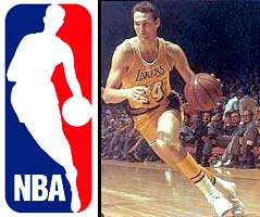
The NBA logo is, outside of the Olympic rings and the Nike "swoosh," the world's most recognizable sports emblem.

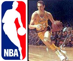
For years, players, fans and journalists have assumed that the figure depicted within the familiar NBA logo is Jerry West, the Los Angeles Lakers' Hall of Fame guard and the current president of basketball operations for the Memphis Grizzlies.

Search the Internet and you'll find sentences like this one, from Sports Illustrated staff writer L. Jon Wertheim in 2003: "(West is) well respected — no, lionized — in his field: one of the top 50 NBA players of all time, one so iconic that his silhouette adorns the NBA's logo."

The man who designed the NBA logo acknowledges that Jerry West is, indeed, Logoman. But the NBA is apparently reluctant to attach West's name to the silouette. (Photo illustration / FOXSports.com)

"It's Jerry West," Hall of Fame center Kareem Abdul-Jabbar told me recently. "I'm familiar with the original photograph from back in the '70s."

"My impression is that it's Jerry West dribbling to the hole," said David Kohler, president of Laguna Hills, Ca.-based Sports Card Plus Auctions and owner of perhaps the largest private collection of Lakers memorabilia. "I know it's always been assumed that it's Jerry West."

And yet, in a league with a well-deserved reputation for hyping even the most mundane milestone, the NBA did not celebrate the recent 35th anniversary of the logo's unveiling. The league has also refused to acknowledge publicly that West is the player in the logo. A high-ranking NBA official who asked that his name not be used told me that the identification of West is an "urban myth" and that the league has "no definitive records" about who designed the logo.

Why does the NBA refuse to admit that the logo is a representation of West? Is their "urban myth" statement PR bunk, or do they know something the rest of us don't?

The answer may lie within the mojo of the logo.

To many observers, the logo is a slam-dunk success. Designed by Alan Siegel and first unveiled in 1969, the image of a silhouetted player dribbling to the hole against a groovy red-and-blue background is ubiquitous: it appears on every uniform of every player, on every backboard in every NBA arena and on every piece of league-licensed merchandise, which generates a very groovy $3 billion in annual revenues.

To others, the logo is an anachronism. Today's players don't wear tight shorts; most don ultra-baggy uniforms and a great many of them have tattoos. In a league whose players are predominantly African-American and where so many of the players (despite race) relate to hip-hop music and/or its cultural significance, "Mr. Clutch" no longer seems to personify the on-court or off-court stylings of the NBA.

The logo, it appears, is stuck in the middle. Is it the ultimate badge of basketball excellence, as represented by a white player who was a perennial All-Star back in the day? Is it a timeless graphic-design icon that, after 35 years, can still serve as the public symbol for the league's global marketing campaigns, from Baja to Beirut to Beijing? Or is it as dated as the set shot?

As the NBA gathers in Houston for its annual All-Star Weekend extravaganza, the debate is getting fierce. New York Times columnist Selena Roberts recently wrote that the logo is "ancient" and that "(NBA commissioner David) Stern should update the logo."

Lakers head coach Phil Jackson disagrees with Roberts. "I like the logo we've got," Jackson explained. "It works fine. It's a flowing style that makes sense, whether it's Jerry West or not."


Logonomics 101

The premise behind any logo, of course, is that it represents a company's identity (in today's parlance, its "brand"). Through the 1950s, none of the "Big Three" professional sports leagues required a logo; sports were more about the games and less about the marketing of the games.

In the 1960s, the sports-business landscape began to change — and rapidly. Network television, and the millions of dollars generated by rights fees and advertising revenue, exerted a powerful force on team owners. The NFL supplanted baseball in popularity thanks to the marketing prowess of its young commissioner, Pete Rozelle, who created an in-house organization, NFL Properties, to license its merchandise — complete with a unique shield-like logo.

The NFL's patriotic-themed emblem signaled a unified, American league — and was very much a sign of the times. "Back then, in advertising circles, every product had to have an image — something with a picture — whether it was Betty Crocker or Tony the Tiger," recalled sports historian Bert Randolph Sugar, former director of marketing at the J. Walter Thompson advertising agency.

The national pastime came next, with Major League Baseball unveiling its red-white-and-blue-silhouetted logo in 1968, just in time for the following year's celebration of the 100th anniversary of professional baseball.

Now, it was basketball's turn. Since its inception in 1946 (as, initially, the Basketball Association of America), the NBA had lagged behind the Big Two, a league in search of an identity. But in the 1960s, as integration opened up the doors of collegiate and professional sports, an influx of African-American talent, from Bill Russell to Wilt Chamberlain to Elgin Baylor to Oscar Robertson, energized the NBA.

Competition from the upstart ABA (in existence from 1967-1976) pushed the NBA; by the end of the 1960s and into the early '70s, with the title runs of the Knicks in New York's newly-opened Madison Square Garden, the three-martini lunch crowd along Madison Avenue's advertising row started to take notice.

With pro hoops poised to be the next big thing, Burbank, Ca.-based Licensing Corp. of America sold the NBA on the value of creating a recognizable trademark. The goal, remembers former Licensing Corp. president Joe Grant, was "to create an umbrella logo that tied together the merchandizing rights" for all of the NBA's teams.

Licensing Corp. hired Siegel, a New York City-based graphic designer who had previously directed the creation of the logo for Major League Baseball. Siegel has since become a well-known "branding and corporate identity" expert; his company, Siegel & Gale created the trademarks for, among many companies, MasterCard and 3M.

Siegel filled in the details in a recent telephone interview. Yes, he personally designed the NBA logo, for a fee of about $10,000, with help from a college buddy — renown sportswriter Dick Schaap.

"I found the original photograph in the archives of Sport Magazine (where Schaap later worked as editor in chief)," Siegel said. "It was an action shot of Jerry West dribbling down the court from one of the Lakers' games. I sketched it, cleaned it up a bit and stylized it. I streamlined the tracing I made — (and) slimmed it down a little bit — so it would work in all applications."

As for the color scheme, Siegel said, "We used red and blue against the white silhouette to create visual harmony with Major League Baseball's logo. I think I gave Licensing Corp. seven ideas, and (then-NBA commissioner) Walter Kennedy gravitated toward the direction that had the same look as Major League Baseball. I think he wanted to create the feeling that the NBA was part of the great American dream in sports — that the NBA was on the same footing as the national pastime."

Siegel credits illustrator Jerry Dior, who designed the Major League Baseball logo when the two men worked together at the Sandgren & Murtha agency, with creating the red-white-and-blue silhouetted motif. Today, Dior's design resonates beyond the NBA; the logos of the PGA Tour, U.S. Figure Skating and the National Lacrosse League, among others, emulate the design of the MLB logo.


The model player

Siegel said that he had no ulterior motive for selecting the photograph of West and that his main consideration was the image's aesthetics. Jerry West, however, was no ordinary player. The son of an electrician who labored for a West Virginia coal company, West joined the Lakers in 1960 after helping the U.S. win an Olympic gold medal at the Rome Olympics. With sidekick Baylor, West practically invented pro basketball on the West Coast. His all-around play earned him annual trips to the All-Star game (including MVP honors in 1972 on his home court, The Forum in Inglewood).

"He's one of the greatest players that's ever stepped on the court," said Abdul-Jabbar, who played against West when he entered the NBA with the Milwaukee Bucks. "Clutch shooter, great heart, played the game at both ends of the floor."

Many consider West's competitiveness to be his greatest attribute. During the 1960s and early 1970s, the Lakers reached the NBA Finals an astounding seven times, and lost every time. West never gave up on winning a championship until, finally, the Lakers prevailed over the Knicks in 1972.

After his retirement, West served three seasons as the Lakers' coach before transitioning to the front office, eventually running the Lakers' basketball operations from 1982 to 2000, and winning praise for building four championship teams. He was hired to guide the Memphis Grizzlies' basketball fortunes in 2002.

"He's a class act," Sports Card's Kohler said. "For the NBA, he is a symbol of excellence."

His identity as the figure in the logo is perhaps the worst-kept secret in sports. In 2000, the Boston Globe's Bob Ryan wrote: "It is not exactly privileged information that the silhouette of a player comprising the official NBA logo is that of Jerry West, a man who resides in the inner sanctum where only the truly great players in NBA history can claim a spot."

On the Basketball Hall of Fame web site, the biography of West includes this sentence: "His image is silhouetted in the NBA logo."

Over the years, however, the NBA has refused to recognize publicly that West is the player in the logo. When I repeated to Siegel the NBA's claim that the identification of West is "an urban myth," he bristled. "That's bull----," he said. "I guarantee you that it's Jerry West."

When I contacted West at his Memphis office, he was reluctant to talk about himself or the logo. "If it is me, I'm obviously honored that they would have thought enough of me to place me there. But I don't think they've ever officially confirmed that it's me."

He acknowledged that he has a copy of a photograph that shows him dribbling against former Atlanta Hawks star Joe Caldwell at the Fabulous Forum in Inglewood. West said that his body positioning in the photograph is identical with the logo. (He also believes that Wen Roberts, the Lakers' longtime team photographer, may have taken the photo.)

Asked about the league's position, West said, "There's been so many great players in the NBA, they don't want to offend anyone. They don't want to single out anyone. If that's me, I'm proud of it. It's served them well for a number of years."

When I asked him if the NBA might have a financial motive for refusing to identify him — that he might be entitled to royalties for the use of his likeness — West chortled. "You publish this story and I'll call (my agent) and find out," he joked.


A league reborn

The West-ified logo made its first public appearance in the fall of 1969, on the cover of that season's "NBA Guide," the statistical reference book published annually by the league. The logo also appeared on players' uniforms the next season, to mark the 25th anniversary of the league, before disappearing from view for a decade.

When the logo next appeared on the "NBA Guide," before the 1979-80 season, the bright promise the NBA had built up during the 1960s and early '70s had almost disappeared. Rumors ran rampant that many of the NBA's players were drug users. The NBA Finals were not broadcast on live TV, but shown on tape-delay near midnight. And, while the merger with the rival ABA in 1976 had infused the league with talent, pro hoops faced an image problem.

The perception, as former CBS announcer Dick Stockton once told me, was that the NBA was "too black." As a die-hard sports fan growing up in New York City, I well remember those times. During the late 1970s, when the Knicks fielded an all-black roster, they were derisively referred to with a nickname containing the "N" word.

At the NBA's darkest hour came salvation, in the forms of Larry and Magic and Michael and David. The transformation began with Larry Bird and Earvin "Magic" Johnson joining the Boston Celtics and Los Angeles Lakers, respectively, and setting up a cross-country rivalry that highlighted exquisite, unselfish team ball. They were soon joined on the court by the Chicago Bulls' Michael Jordan, whose winning ways were augmented by a Spike Lee-directed advertising campaign for sneaker-behemoth Nike that turned him into the world's most recognizable and marketable sports star.

Away from the court, David Stern replaced Lawrence O'Brien as league commissioner in 1984. Stern ramped up the NBA's marketing efforts and took advantage of new technology that spread the game — via satellite television and, later, the Internet — to distant lands. "I Love This Game!" became a mantra that didn't need a translator, especially after the league unleashed the dominant "Dream Team" at the 1992 Barcelona Olympics.

One of Stern's most subtle, but shrewdest, acts was to revive the logo. It returned to players' uniforms during the 1986-87 season and became an important symbol for the revitalized game. Revenue soared as the league mined new trends (video games and movies, cable television, "throwback" jerseys, corporate alliances). The global marketing strategy paid dividends beyond merchandise sales as talented foreigners made the NBA their destination. From Germany came Dirk Nowitzki, from Argentina came Manu Ginobili, and from China came the biggest prize of them all: Yao Ming.

"As commissioner Stern brought his marketing skills to bear, the NBA went from being mildly popular in the early 1980s to becoming the worldwide commodity it is today — an identifiable American brand as visible as Starbucks and McDonald's," said USC professor of cinema Todd Boyd, author of "Young, Black, Rich and Famous: The Rise of the NBA, the Hip-Hop Invasion and the Transformation of American Culture."


The next generation?

Even as NBA coffers filled with dollars, marks and yen, trouble was brewing in paradise. Bird, Johnson and Jordan gave way to the next generation, and the NBA's core product — the game of basketball — appeared to suffer. As journalist Michael Sokolove wrote in the New York Times, the players are "so young, so green, so unschooled (four years of college is now exceedingly rare), and so raised on a diet of ESPN highlights that many have nothing but so-called N.B.A. bodies. Unbelievable as it may seem, you can make millions in today's NBA without having even one semi-reliable way to put the ball in the basket — no jump shot, no hook shot, no little 12-foot bank shot."

Further trouble came in 2004, when the U.S. team comprised of NBA stars was humbled at the Athens Olympics and took home "just" a bronze medal. And then, the proverbial last straw: the brawl at Auburn Hills last season, when Indianapolis Pacers guard Ron Artest charged into the stands and fought with fans after being pelted by a beer.

The incident was a public relations disaster for the NBA and fueled a backlash. League executives, who had previously encouraged the marriage of hoops and hip-hop, now worked to distance themselves from what some perceive to be its image. Stern pushed through rules that raised the players' minimum age to 19 and instituted a dress code, both on-court (uniforms must not droop lower than the kneecap) and off-court (no doo-rags and oversized jewelry while at the arena).

These measures may or may not repair relations between players and fans. But they suggest that the NBA, for all its success, finds itself in the midst of an identity crisis. And, that begs the questions: does the present logo represent today's brand of the NBA? If not, should the NBA retire it and bring in a sub?

Dallas Mavericks owner Mark Cuban thinks that the logo works fine, but he says the league needs to improve its marketing efforts. "(The logo) represents the NBA, but it's how you enable the brand that matters, not the logo itself," he said. "It's a much more competitive environment (today), and we've got to work harder at it. Unless we have a good marketing program, the logo is irrelevant."

"I think this is a business decision for the corporate thinkers in the NBA," said Richard Lapchick, founder and director emeritus of the Center for the Study of Sport in Society at Northeastern University. "They have to figure out if it would be better to change the logo to make it more reflective of the league's players or to keep the logo that has such a rich history. The big qualifier with this is that the NBA has such a progressive record regarding its racial hiring practices in terms of who runs the game — head coaches, team presidents, even owners."

Said designer Siegel: "I wouldn't change it. I wouldn't try to modernize it. I wouldn't put longer pants on it. It's an iconic symbol that represents a classic presentation of basketball."

West says, "It doesn't bother me at all (if the NBA updates the logo). But there's so many great players that have played over the years — Magic Johnson, Larry Bird, Michael Jordan. I don't know how they (could) decide."

Lakers forward Lamar Odom believes that "some things are meant to stay the same. Yet, there's always time for change. If you want to put someone on a logo, as far as the impact and what they've done in the league, there's probably only one person you should put on that logo: Michael Jordan."

But a quipping Phil Jackson said, "Update it to what? A guy carrying the ball instead of dribbling the basketball?"

Ultimately, standing pat with the current logo reflects sound business principles. To alter the trademark would signify major panic in the NBA's marketing strategy. The NBA needs some tweaking (have you seen how much tickets cost these days?), but it doesn't need a new identity. Besides, Odom's suggestion for the best candidate to sub for West, Jordan, already has his own personal logo: the "Airman," designed from an image of one of his spectacular dunks and used on Nike and Air Jordan products.

There's a third route the NBA could take: retain the traditional logo on uniforms and in arenas, but introduce a new one for other uses (say, video games). It's a compromise that could backfire (can you say New Coke?). But with two logos, the league could retain the value of the historic logo and have another for Generation Next.

The NBA has some experience in this: when the league created the offshoot WNBA in 1997, a feminized logo was introduced that echoed the NBA logo. Most recently, the logo for the NBA Development League was designed to resemble the original.

The league should come clean and admit that West is the player in its logo and honor the fact that its public symbol is also one of its upstanding citizens.

The NBA should honor its connection to the past that, not so long ago, helped launch pro hoops into the modern era. The logo is NBA basketball, and the league should celebrate that.

Thanks to David Davis at FOXSports.com.
Monday, February 27, 2006

The Persistence of the Exotic Menial

It was September, 1981, when design critic Ralph Caplan first unveiled the phrase. He was speaking at a Design Management Institute conference in Martha's Vineyard. His talk was titled "Once You Know Where Management Is Coming From, Where Do You Suggest They Go?"

"I want finally to address in some detail," Caplan said toward the end of this talk, "a role that I call 'the designer as exotic menial.' He is exotic because of the presumed mystery inherent in what he does, and menial because whatever he does is required only for relatively low-level objectives, to be considered only after the real business decisions are made. And although this is a horrendous misuse of the designer and of the design process, it is in my experience always done with the designer's collusion."

It's 25 years later. Has anything really changed?

Continue reading The Persistence of the Exotic Menial.


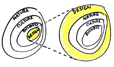
This napkin sketch by Bruce Mau says it all.

That's Right,

HMK

Thanks to Michael Bierut and The Design Observer