Monday, November 13, 2006

30 Seconds, If Your Lucky


The idea that if you build it, they will come, might have worked for Kevin Costner in the movie “Field of Dreams,” but it certainly does not hold true for Web sites.

Build a bad-looking small-business site filled with poorly written text, and your potential customers will go away. Build one that is attractive, compelling and clever, but crucial design mistakes will still guarantee that few people will know that the site exists.

Your Web site is like a digital business card, designers say, the first online look at your company that a customer gets. With luck, it will not be the last.

A site must have addictive content, said Vincent Flanders, a Web design consultant in the Seattle area who is the creator of Webpagesthatsuck.com, a site that analyzes why some pages do not work. “People must be willing to crawl through a sewer for it.”

It is not just small operations that make a mishmash of their sites. Large companies can be just as prone to major design mistakes.

One global company states on its home page that “Indigenous and proven career management tools coupled with a comprehensive series of integrated initiatives have been evolved, to ensure that employees continue to sustain a high performance culture, while recruitment and selection is based on necessary competencies.”

That is “just gobbledygook,” Mr. Flanders said. “The words are not understandable by humans.”

According to Jakob Nielsen, a Web site consultant and author of the book “Prioritizing Web Usability,” it is essential that a Web page get a company’s message across quickly, because visitors are a fickle bunch. Most people do not go beyond what is in front of their faces.

Studies by Mr. Nielsen’s company, the Nielsen Norman Group, an Internet design firm in Fremont, Calif., show that only 50 percent of Web visitors scroll down the screen to see what lies below the visible part on their PC monitor.

“Users spend 30 seconds reviewing a home page,” Mr. Nielsen said. “A business must encapsulate what they do in very few words.”

With findings like those, it is no wonder that Web pages must visually hit a visitor right between the eyes. If a site does not answer a user’s questions about a business, then you have scored one for the competition. For example, the first thing customers visiting any restaurant’s Web site want to know is when it is open. But often that information can be found only by digging through multiple pages. As a result, “the site fails,” Mr. Nielsen said.

“It’s all about the basics,” said Baris Cetinok, Microsoft’s director of product management for Office Live, a site that offers free Web hosting and design tools for small businesses.

Visitors must immediately find out “who you are, what you do and how people can reach you,” Mr. Cetinok said.

Besides good grammar, Mr. Nielsen suggests that companies list a physical address, include a photograph of the building and not ask potential clients to fill out a form simply to ask a question. “That immediately communicates danger,” he said.

Making a site look good is complicated by the fact that no two monitors will necessarily present the Web in the same way. Users can set their browser’s default font size to be bigger or smaller, so it is impossible to know exactly how text will appear to any one person.

And how much of a Web site’s home page can actually be seen by users varies, based on the screen’s resolution.

The problems are made worse by designers being in Los Angeles or New York, and not, say, Texas, so “they think everyone has a large monitor and a fast D.S.L. connection,” said Neil Hettinger, co-owner of Lead Pencil Ad Design, a marketing and design company in Manhattan Beach, Calif. He suggests mixing text and graphics on a Web site, with dark type set against a light background for easy reading.

If you are selling a product, use thumbnail photos that can be enlarged when clicked on, Mr. Nielsen said, not a graphic that can be rotated in every direction. Otherwise “you see products at weird angles.”

“The most important rule in Web page design is to eliminate unnecessary design,” Mr. Flanders said. He recommends not adding large, spinning graphics that take a long time to download.

He also advises business owners not to add introductory splash pages that force a viewer to watch a video or animation.

“Splash pages are only needed for pornography, gambling and multinational Web sites that need to direct users to a particular country’s page,” Mr. Flanders said.

Graphics also do nothing to help a site get discovered by search engines like Google or Yahoo. Those sites troll the Internet for key words, as well as the frequency and quality of one site that links to another.

Text embedded in a graphic, like the name of a shop in a photograph, cannot be seen by search engines. And the old practice of embedding key words in white-on-white type will not increase a site’s page ranking; in fact it will do the opposite.

“The first time a word is used on a site, it’s significant,” said Matt Cutts, a Google software engineer. “If that word is used 50 times, there is a diminishing return.”

“If you put hidden tags on your page, you’re a total moron,” Mr. Flanders said. “You will get caught by search engines, or others will turn you in.”

If your business is local, make sure that the entire geographic area you serve is mentioned in text on the site. To increase the number of sites that link to yours, list your business in online trade directories, and mention it on various blogs.

Google offers free Web master tools that automatically analyze a site to determine if it is being optimized by search engines.

In the end, getting a prominent placement in a search engine is the only way to ensure that your site will be seen by those who can increase your business.

“If your site is not listed on the first page of search results, you might as well not exist,” Mr. Nielsen said.

Thanks to Eric A. Taub at The New York Times

Sunday, November 12, 2006

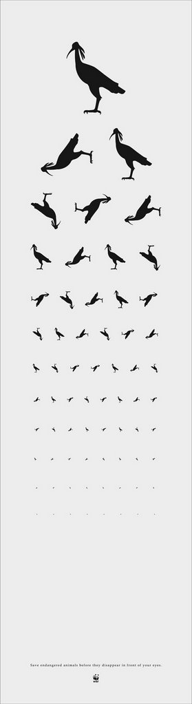
WWF Poster


Save endangered animals before they disappear in front of your eyes.
Nice stuff from CC&E, Guangzhou, China

That's Right,

HMK

Saturday, November 11, 2006

Fleet Street Scandal


Afternoon Tea On Threadneedle Street By Chris Turnham

Check out the awesome collected works of illustrators Kevin Dart & Chris Turnham.

That's Right,

HMK

Friday, November 10, 2006

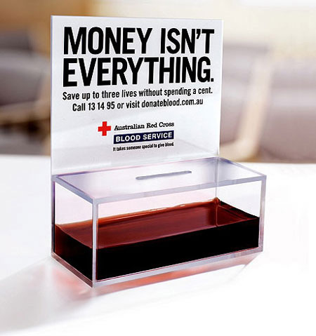
Give It Up


The Red Cross of Australia ain't asking for your money, they need blood.

Nice stuff from M&C Saatchi.

That's Right,

HMK

Thursday, November 09, 2006

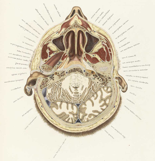
National Library of Medicine


The NIH has an incredible collection of scanned anatomical books.

The illustrations are truly amazing.

Check out the National Library of Medicine's Collection.

That's Right,

HMK

Make Your Own Vodka!


Now it's easier than ever to make your own Vodka!

Ya Here!

That's Right,

HMK

Wednesday, November 08, 2006

The Art Of Complex Problem Solving


I'm sure that most everyone probably agrees with the idea that ideas live or die by how well they're communicated.

What really needs to be addressed, in most situations involving more than 5 people, is the fine art of follow through and the respect of other peoples time, enabling everyone involved to do their best.

Information is useless when it sits on somebody's desk until the 11th hour or later. And at the end of the day, nobody remembers how many rabbits were pulled out of the hat, just that the deliverables were less than stellar.

No wonder there's a virtual revolving door at most shops and the annual employee Christmas party attendees are never the same from year to year.

It's amazing what can be accomplished when people have mutual respect and trust for each other and information is shared in a timely manner. If you've ever been in a situation without the above respect, you're probably familiar with lines like "It's like this everywhere" and "Get used to it, that's just the way it is." Well, it's not.

It may be the law of the land in the egocentric bottom-line driven big agency environment, but as you've probably experienced with true friends and colleagues, there are places where the common goal is bona fide trust and respect. It just takes a while to find your place, but it does exist.

Bottom-line, as my friend Tom Rehkopf (one of my true-blue-go-to-guys since 1978) says, "If you like what you're gettin' - keep doin' what you're doin'. If you want something different, do something different."

Thanks Tom.

Meanwhile, check out these nice infographics at The Art Of Complex Problem Solving.

That's Right,

HMK

Tuesday, November 07, 2006

The Invisible Hand


If you're interested in the ideas behind business and strategic thinking, I think you might dig Chris Gondek's podcast, The Invisible Hand.

Each week, Chris brings you the authors and books that have formed our modern ideas of management and strategy.

At times this can be a bit dry, as some of the guest authors are somewhat long winded, but over all, these are guaranteed to get your brain jumstarted and they go great with a few cups of morning coffee.

Get smart and enjoy!

That's Right,

HMK

I May Have Voted


Cartoon by Chan Lowe, The South Florida Sun Sentine

And remember - if you don't vote - don't bitch.

That's Right,

HMK

Friday, November 03, 2006

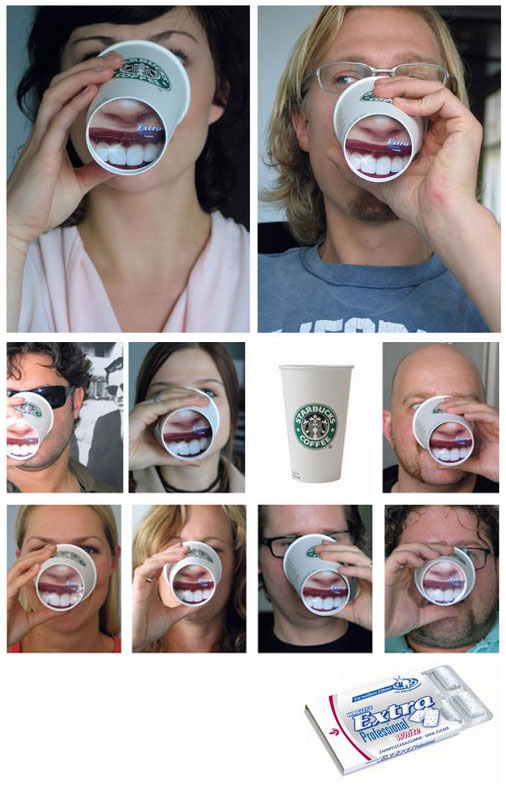
Wrigley Extra


The trick now is training the Starbucks baristas to take the time to line up the image with the lid... Otherwise, this is a pretty cool and fun idea.

That's Right,

HMK

Tuesday, October 31, 2006

Do The Dewey


Forget Google! Ms. Dewey is a new, interactive, Flash based search engine.

To assist you in your search, the website is hosted by smoking hot model/actress/vocalist, Janina Gavankar.

See what she and the site are capable of by typing into the search field, or just leave it blank and watch.

Check out MS. Dewey and her groovy search site.

That's Right,

HMK

Monday, October 30, 2006

Bongo Menu Collection


Some time during the middle of the last century, a man got the yen to start taking home menus from the restaurants he'd enjoyed.

Fifty years later, his collection is in the hands of his grandson.

Some really sweet stuff over at Bostrom's Menu Collection flickr site.

That's Right,

HMK

Sunday, October 29, 2006

Another Bright Idea


Not sure if I'm totally down with this or nor yet, but the more I think about - why not?

Brazil's Sol Beer has co-oped with the national the weather forecast.

This makes me thirsty, like when it's hot. Ohhh, I get it now!

Genius.

That's Right,

HMK

Saturday, October 28, 2006

Haunted When It Rains


Yeah, I realize this is a tad bit creepy - but it is Halloween after all.

If you dare, visit the Book of the Dead, Haunted When It Rains, Victorian Post-Mortem Photography.

And remember - you're not going to be here forever either, so Carpe Diem!

Life is meant to be awesome!

That's Right,

HMK

Friday, October 27, 2006

John Dufilho: Best Alternative Album?


Probably, yes!

Grande Congratulations to my amazingly talented buddy John Dufilho!

His first official solo album, geniusly entitled: John Dufilho, is up for a Grammy. (Sir John's better known as the lead monkey in the amazing Deathray Davies.)

There's some pretty stiff competition - John's in a field of 48 other albums, including Arctic Monkeys, Gnarls Barkley and Thom Yorke.

I've been working with John and his lable Glurp producing some super low-fi videos, one for each song on the album.

The finalists for the 2007 Grammys will be announced Dec. 7.

Check out the first one from the opening track I'm Gonna Stay Under These Covers Today.

Check out the rest (so far!) at John's new site: John Dufilho

John's currently in Lexington right now rehearsing with the Apples In Stereo sitting in as drummer for some shows next week and will be in NY shooting a new Apples video with Elijah Wood directing.

Go John!

And what are you waiting for - go Buy The Album Now!


That's Right,

HMK

Wednesday, October 25, 2006

D Is For Discrepancy


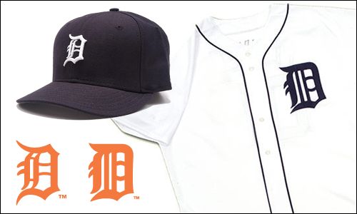
With Detroit's storybook season now culminating in the World Series, many fans have begun noticing one of MLB obscurities: The Old English D logo on the team's jersey is different than the one on the cap.

No way, you say? Way, says Uni Watch. At first glance, the two logos appear almost identical. But once you take a closer look, the distinctions start jumping off the screen: The perimeter of the cap D is comprised of jagged, pointy strokes, while the outline of the jersey D is much rounder; the left side of the cap D has two vertical strokes, both of which are curved, with two horizontal spokes in between them, while the jersey D has three vertical strokes, two of which are straight, and no horizontal spokes; and the two horizontal prongs inside the center of the cap D are concave, while the prongs on the jersey D are convex. Identical twins? More like second cousins.

Read it all at Uni Watch.

Go Cardinals!

That's Right,

HMK

Tuesday, October 24, 2006

Authenticity


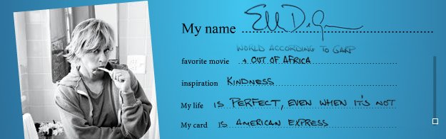
Buzz-worthy campaigns turn ad-agency creatives into the cool kids of the moment. But behind every copywriter-cum--rock star is a courageous client. Meet the people who had the guts to greenlight this past year's boldest advertising.

My personal favorite is the AMEX My Life My Card campaign. As Diego Scotti,VP of global advertising for American Express puts it - "Authenticity is the thing consumers respond to the most."

That's Right.

Read it at all Fast Company.

Fluff is no substitute for a concept.

HMK

Monday, October 23, 2006

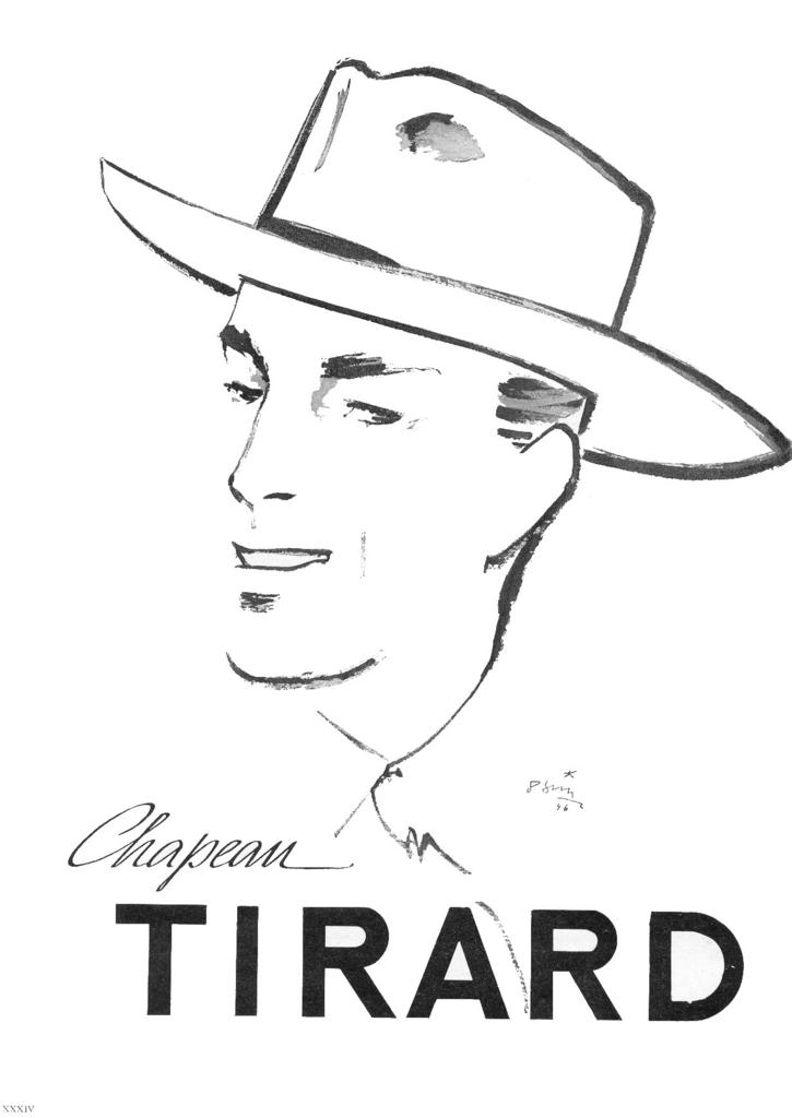
Des Chapeaux


Hats off Pita and her sweet French retrospective over at Des Chapeaux.

Cela a Raison,

HMK

Friday, October 20, 2006

A Craving For Cool


Big companies are outsourcing "cool" to nimbler, closer-to-the-ground outsiders. They might as well farm out their souls.

Read the Fast Company article here.

Other companies seek out the best talent, hire them outright with promises and golden carrots with hopes of capitalizing on their unique perspectives and innate talent.

Sadly, these companies end up forgetting the all reasons they initially hired the talent and end up trying to force the energetic and innovative square peg into the predictable and safe round hole .

Bottom-line for the duped: Stay true to yourself, live and learn, get it in writing and pay no attention to that stupid fish on the bumper.

That's Wrong,

HMK

Wednesday, October 18, 2006

Mmmmm. Beer...


To learn more about some of the new dark brews launch this Interactive Beer thing I borrowed from The New York Times.

Thanks NYT!

That's Right,

HMK

The Art of Being Blunt & Cutting To The Chase


Meet Paula Scher. A ferocious defender of language, she has given voice to many of America's iconic brands.

Unless you're part of the clubby graphic-design fraternity, you may never have heard of Paula Scher, but it's nearly impossible not to know her work. Every time you pass a Citibank ATM or hand over one of its credit cards with the iconic red-arched "Citi" logo, you're in her orbit. When you open a box from Tiffany, with its slender, elegant typeface, you're decoding a message she has sent you (namely, "This had to be pricey!"). If you get subversive pleasure reading Jon Stewart's snarky faux textbook, America (The Book), or are charmed by the signs on the New York subway for the Metropolitan Opera, or look back wistfully on the loopy spaceship cover of the first Boston album, you're under the spell of this astonishingly versatile, formidably talented designer.

Within the design community, Scher is known both for her passionate populism--she has little patience for esoteric "just those of us who speak Helvetica" snobbery--and for her take-no-prisoners defense of good work. "As a designer, Paula has no particular ideological point of view," says Michael Bierut, her partner at the prestigious design firm Pentagram. "She's really, really eclectic. She only cares about making things that are good."

Corporate clients who have worked with her marvel at her willingness to fight for what she thinks is the best solution to any given problem. "She's uncompromising," says Susan Avarde, managing director of global branding for Citigroup's consumer businesses. "That stance can feel challenging, but for us as an organization, it was the right thing." Scher's Citibank identity campaign gave coherence to a politically fraught corporate merger (the logo cleverly used the "t" in Citi as the handle for the old Traveler's insurance umbrella) and made the resulting behemoth simpler and more approachable.

Scher's Valkyrie reputation stands in stark contrast to the woman herself, a slight blonde with a wicked sense of humor who roams New York's Pentagram offices trailed by an Australian shepherd named Mattie. And her bravado, Scher confides, is in many ways a construct built out of necessity. It isn't easy being a woman in a profession dominated by men on both the design and client sides. Earlier in her career, she says, "When I would be in a room with a man, all eyes would go to him. I always felt sidelined. I had to work so hard to hold attention."

She compensated with wit and verbal acuity. "I styled myself as a young smart-ass," she says. "It served me reasonably well for a number of years."

The woman is too modest. You don't get a medal from the American Institute of Graphic Arts, a place in the Art Directors Club Hall of Fame, representation in the collections of MoMA and the Cooper-Hewitt, and become a Pentagram partner just for being brassy.

Still, the kickass street-fightin' woman is never far off. Take, for example, her most recent accolade: being named a finalist for a National Design Award for communication design. Honorees were invited to the White House for breakfast, an invitation few could resist. Scher, however, refused to go, writing a letter (cosigned by four other winners) protesting the Bush administration's "prolonged assault on meaning."

"I'm not going to put on a party dress and play nicey-nicey because Laura Bush is having tea with people she doesn't know who the hell they are anyway," she bristles.

That kind of outspokenness can scare away timid clients, says Bierut. "I've learned a lot from Paula about the advantage of being blunt and cutting to the chase. There's no point in luring people into thinking you're a nice, accommodating person who will do it any way they want if you're concealing this spine of steel."

It's a lesson Scher learned painfully, early in her career, after watching good work get diluted as it worked its way through the corporate food chain. Most organizations, she says, rely on a process of checks and balances to ensure that the design adheres to some particular corporate strategy--that's the language MBAs understand. Trouble is, graphic design is inherently subjective. Who can say that one font is quantifiably better than another, or that one shade of Pantone green will lead inevitably to the destruction of your brand? Without a passionate advocate, a strong initial design may be nibbled away by bureaucrats, each eager to prove his worth with a tweak here and a nip there. Scher's ability to persuade, she realized, rested on two things: "I would have to be perceived, first, as an absolute authority, and second, as the most powerful person to approach about design.

"Fifty percent of doing good work is actually having it made," says Scher. "And getting it made means understanding the obstacles." The key, she quickly discovered, was having a client with both the vision to recognize good work and the power to pull the trigger. It's what Steve Jobs brings to Apple, or A.G. Lafley to Procter & Gamble. Barring a visionary at the helm, Scher prays that she can instill enough confidence and trust in her clients so that she can persuade them to follow her lead.

Fortunately, besides an outsize graphic talent, Scher also has an exceptional EQ: She can read a room and know instantly where the power lies, who's an ally, and who's potential trouble. Ultimately, though, the critical skill for Scher is knowing how to stay fresh, to keep challenging herself by tapping into what she calls the "charm of ignorance." When you're feeling stale, she says, the best thing you can do to shake things up is to "look at what you've been doing for the past five years--and stop. The thing that's most to be feared is doing the same thing over and over again."

Thanks to Fast Company

Tuesday, October 17, 2006

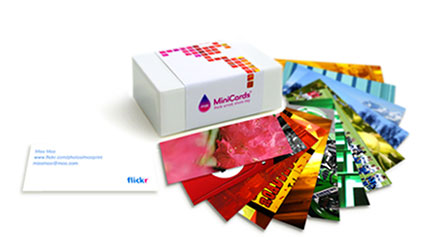
Moo Cards + Flickr


Check out Moo Cards. If you're smart and you've got your photos on flickr, for just $20 you can get a box of a 100 of your favorite shots and custom messages.

I hear they're quite nice. I 'll have more feedback when I get mine.

That's Right,

HMK

Monday, October 16, 2006

Chinglish


There's a nice collection of Chinglish signs and products over at flickr.

Happy time please to check them out!

That's Right,

HMK