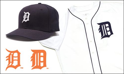
With Detroit's storybook season now culminating in the World Series, many fans have begun noticing one of MLB obscurities: The Old English D logo on the team's jersey is different than the one on the cap.
No way, you say? Way, says Uni Watch. At first glance, the two logos appear almost identical. But once you take a closer look, the distinctions start jumping off the screen: The perimeter of the cap D is comprised of jagged, pointy strokes, while the outline of the jersey D is much rounder; the left side of the cap D has two vertical strokes, both of which are curved, with two horizontal spokes in between them, while the jersey D has three vertical strokes, two of which are straight, and no horizontal spokes; and the two horizontal prongs inside the center of the cap D are concave, while the prongs on the jersey D are convex. Identical twins? More like second cousins.
Read it all at Uni Watch.
Go Cardinals!
That's Right,
HMK