Friday, June 30, 2006

Cannes Lions International Ad Festival


Along with the other purposes it serves, (excuses to eat, swim, drink and frolic) the Cannes Lions International Ad Festival is also a window on the best and most interesting TV commercials produced outside the U.S. each year. Check out 10 Spots from other countries that were standouts at this year's event.

That's Right,

HMK

Thursday, June 29, 2006

Right On Time


Agency: Jung Von Matt, Hamburg.

Animation Archive

Click To Enlarge

Just a small sample of some of the awesome animation and drawing tips at the International Animated Film Society.

The International Animated Film Society: ASIFA-Hollywood has embarked on an ambitious project to create an animation archive, museum, and library for the benefit of the animation community, students and general public. The first phase of this project involves the creation of a VIRTUAL ARCHIVE which will house images, movie clips and sound files pertaining to the art of animation.

Get your pencils out!

That's Right,

HMK

Tuesday, June 27, 2006

No Brainer


DaimlerChrysler will finally be selling its smallest Smart car, a minicar that fits on top of a regulation pool table, in the U.S as soon as 2008. It's about time...

That's Right,

HMK

Monday, June 26, 2006

The Mysterious Power of Context

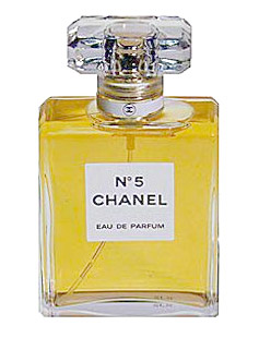
Label for Chanel No. 5, Gabrielle Bonheur "Coco" Chanel, 1921

Story thanks to Michael Bierut

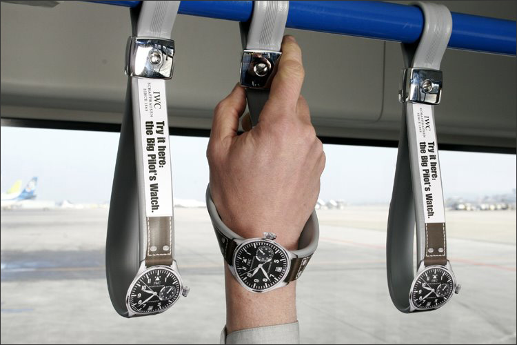
A while ago, I was designing the identity for a large, fashion-oriented organization. It was time to decide which typeface we'd use for their name. Opinions were not hard to come by: this was the kind of place where people were not unused to exercising their visual connoisseurship. But a final decision was elusive.

We decided to recommend a straightforward sans serif font. Predictably, this recommendation was greeted by complaints: it was too generic, too mechanical, too unstylish, too unrefined. I had trouble responding until I added two more elements to the presentation. The first was a medium weight, completely bland, sans serif "C." "Does this look stylish to you?" I would ask. "Does it communicate anything about fashion or taste?" Naturally, the answer was no.

Then I would show the same letter as it usually appears as the first in a six-letter sequence: CHANEL. "Now what do you think?"

It worked every time. But how?

The answer, of course, is context. The lettering in the Chanel logo is neutral, blank, open-ended: what we see when we look at it is eight decades' worth of accumulated associations. In the world of identity design, very few designs mean anything when they're brand new. A good logo, according to Paul Rand, provides the "pleasure of recognition and the promise of meaning." The promise, of course, is only fulfilled over time. "It is only by association with a product, a service, a business, or a corporation that a logo takes on any real meaning," Rand wrote in 1991. "It derives its meaning and usefulness from the quality of that which it symbolizes."

Everyone seems to understand this intellectually. Yet each time I unveil a new logo proposal to a client, I sense the yearning for that some enchanted evening moment: love at first sight, getting swept off your feet by the never-before-seen stranger across the dance floor. Tell clients don't worry, you'll learn to love it and they react like an unwilling bride getting hustled into an unsuitable arranged marriage. In fact, perhaps designers should spend less time reading Paul Rand and more time reading Jane Austen: after all, it is a truth universally acknowledged that a corporation in possession of a good fortune must be in want of a logo, isn't it? Finding that one perfect logo is worth its own romantic novel.

All of this is compounded by the fact that designers themselves have very little faith in context. We too want the quick hit, the clever idea that will sell itself in the meeting and, even better, jump off the table in design competitions. More than anything, we want to proffer the promise of control: the control of communication, the control of meaning. To admit the truth — that so much is out of our hands — marginalizes our power to the point where it seems positively self-destructive. This is especially true in graphic design, where much of our work's functional requirements are minimal on one hand and vague on the other. "The pleasure of recognition and the promise of meaning" is a nice two line performance specification, but one that's impossible to put to the test.

Yet all around us are demonstrations of how effective a blank slate can be. It's just hard to learn from them. I'd like to think, for instance, that I'd see the potential of a red dot in a red circle if I was designing a logo for a company named Target. But in truth I'd probably say, "What, that's all?" and not let it into the initial presentation. How, after all, could you guarantee that the client would invest 40 years in transforming that blank slate into a vivid three-dimensional picture?

Appreciating the power of context takes patience, humility, and, perhaps in the end, a sense of resignation. You sense it in this account of designer Carolyn Davidson's disappointing presentation for her first big ($35) freelance project:

After sifting through the stack of drawings, Knight and the other men in the room kept coming back -- albeit with something less than enthusiasm -- to the design that looked like a checkmark.

“It doesn’t do anything,” Johnson complained. “It’s just a decoration. Adidas’ stripes support the arch. Puma’s stripe supports the ball of the foot. Tiger’s does both. This doesn’t do either.”

“Oh, c’mon,” Woodell said. “We’ve got to pick something. The three stripes are taken.”

That was the trouble, thought Davidson. They were all in love with the three stripes. They didn’t want a new logo; they wanted an old logo, the one that belonged to Adidas. Davidson liked [them] but found it disheartening to go out on her very first real job and get this kind of reception.

We all know the ending to this story: the client grudgingly accepted Carolyn Davidson's chubby checkmark, and the rest, as recounted here in Swoosh: The Unauthorized Story of Nike and the Men Who Played There is corporate identity history. The swoosh has proven durable enough to stand for the company's dedication to athletic achievement, its opponents' resistance to the forces of global capital, and a lot of things in between. Sometimes, the client is smarter than we think. Give Nike founder Phil Knight credit: he had the vision to admit, “I don’t love it. But I think it’ll grow on me."

Maybe he believed it. Or maybe he was just tired of trying to decide. Either way, context did the rest.

That's Right,

HMK

Friday, June 23, 2006

Oi Vey!


Leave it to Tivoli Audio. They've introduced the new iYiYi home speaker system.

Available in black or white, the iYiYi features a built-in universal docking station for use with all dockable iPods, as well as a digital AM/FM radio, built-in alarm and digital clock. The system also sports two 3” full-range drivers, a remote control, auto-brightness blue backlit LCD display, rubberized knobs, Radio Data System (RDS) support, an auxiliary input, and stereo headphone output.

Tivoli said the iYiYi—which apparently gets its name from the Yiddish phrase contextually translated as “what will they think of next?”—will be available this Fall for $300.

Tivoli Audio


That's Right,

HMK

Wow-Fi!


We’ve all been patiently waiting for a combination record player, MP3 player, CD player and wine/liquor rack and now CucumberLab, a design firm that specializes in making avant-garde designs for all sorts of quirky things, has delivered one unto us with its Sound Machine. The speaker is clearly inspired by the old gramophone, from which 200 watts of CucumberLab sound bellow. Never mind that it looks pretty decent, too, with a high gloss Awlgrip finish.

The wine/liquor rack holds 12 bottles, ensuring your turn-of-the-century theme party goes off without a hitch, all with grade A whiskey within arm’s reach. Just don’t get too soused that you can’t appreciate the 8” subwoofer. It’s like your house has become a speakeasy seemingly overnight. Thanks, CucumberLab & Nicholas Deleon!

Good luck getting a hold of one, though, since it’s only available in “limited production,” and their phones appear to be ringing off the hook.

Cucumberlab

That's Right,

HMK

Tuesday, June 20, 2006

With Apologies To The Little General...

Go Sox!

Photo by Steven Pinker

If you say "pa-JAM-uzz" instead of "pa-JAHM-zz" or "yooz guys" instead of "ya'll," chances are, you're a Yankee. If you call a bag a sack or pronounce route as "rout" instead of "root," you're probably a rebel.

You can figure out just how much of Southerner you are by taking an ONLINE QUIZ called "Are you a Yankee or a Rebel?" It asks questions about how you pronounce certain words and phrases and then calculates the amount of Dixie in your speech.

That's Right,

HMK

P.S. Accoring to the quiz I'm a Yankee... Go Sox!

Monday, June 19, 2006

This Has Nothing To Do With Pink Floyd


Dig old radio?

What about Sci-Fi?

Well, you're in luck my friends - because Zombie Astronaut is back!

Forget today's fancy podcast caca and go grab some real deal old time radio classics. Perfect for your headphones and evevn better on dark rainy nights just before bedtime!

Dark Side Of The Moon
Though the original moonwalk happened just over 35 years ago (providing you don't believe it was staged), in the days preceding that historical event we were forced to imagine what it'd be like to wander the surface or the moon. Most visions of this development involved hostile alien life forms whose technology surpassed ours. In this SF68 episode, recorded roughly a year before Armstrong, Aldrin and Collins stopped by, our astronauts do encounter an alien lifeform, though it's much simpler... and much deadlier.

As the Supernova speeds toward the moon, the astronauts aboard, Dick Revero, Charles Paris and James Casey, expect to land on a barren landscape, but there's something alive there... something swirling in the dust...

Go get Dark Side Of The Moon now!

You'll dig!

That's Right,

HMK

Tuesday, June 13, 2006

Lorem Ipsum


Lorem ipsum dolor sit amet, consectetur adipisicing elit, sed do eiusmod tempor incididunt ut labore et dolore magna aliqua. Ut enim ad minim veniam, quis nostrud exercitation ullamco laboris nisi ut aliquip ex ea commodo consequat. Duis aute irure dolor in reprehenderit in voluptate velit esse cillum dolore eu fugiat nulla pariatur. Excepteur sint occaecat cupidatat non proident, sunt in culpa qui officia deserunt mollit anim id est laborum.

Excepteur sint Lorem Ipsum

Duis Aute,

HMK

Monday, June 12, 2006

Blink!


Clear Channel is discussing the idea of one-second radio spots with marketers and media buyers. Blinks are one-second commercials.

The real value of the Blinks, as they are being called, may be in the publicity they can generate. After all, you're already reading an article about them, and the short spots are only in the concept stage.

The radio giant, however, says it didn't think up Blinks as a promotional stunt. "It really is to find new uses of radio for advertisers who are continually asking us to demonstrate that our medium can successfully extend brands, can successfully reach the consumer with touchpoints that are new and surprising" said Jim Cook, senior VP-creative for Clear Channel Radio.

Audio Mnemonics
The Blinks could be used in a number of ways. Clear Channel's Creative Services Group crafted a demonstration spot using the McDonald's jingle, minus the "I'm lovin' it" language, and placed it between one hip-hop song and another. The group also created a Blink for BMW's Mini Cooper with a horn honking and man's voice saying "Mini," and placed it before miniaturized news reports. (Neither marketer has a deal with Clear Channel for Blinks.) Other audio mnemonics that could use Blinks are the Intel chime and the NBC bells.

Jim Gaither, director-broadcast at Richards Group, has been in conversation with Clear Channel about three-second spots. "It's not building a brand; it's refreshing a brand," he said, adding: "You can't use a one-second campaign for something that generally has not been advertised before."

Frequency Needed
You also need frequency, because if you just hear a sound and nothing else, the message is going to have to be driven into the consumer, Mr. Gaither said. It's also best suited to a marketer's core customer, because those are the people for whom the Blink will have the most impact, he said. Mr. Gaither said he doesn't think he has a marketer at the moment that perfectly fits the bill.

But would marketers want to be so brief? Andrew Goldstein, instructor of a broadcast-media-writing course at the Miami Ad School and a copywriter at Zimmerman Advertising, isn't convinced national advertisers would want a sound effect thrown into the programming. "You're not going to know it's connected to the brand, and it's going to lose its value," he said.

Lauren Russo, managing director-local radio at Horizon Media, said, "I can't see any advertiser, any agency paying for a spot that's one second." If Clear Channel came to her to buy the ads, she wouldn't be interested. "If they want to throw it in at no charge, I don't think we would say no," she said, but, "I just don't see how you can communicate anything in that little time period." Clear Channel said it hasn't decided on pricing and package information, but Mr. Gaither estimates that the time may be sold at a 200% to 300% increase on what one-thirtieth of a 30-second spot might cost.

Hard To Verify
And when it comes to verifying that the spot ran, there could be a problem. TNS Media Intelligence can track broadcast spots that are five-seconds or more in length, with the possibility of tracking three-second spots with some development, said Richard Radzik, VP-broadcast verification services at TNS Media Intelligence.

In the late 1990s, Cramer-Krasselt, a Chicago-based independent ad agency, did a one-second TV spot for Master Lock in which a padlock is shot with a bullet in front of a bull's-eye. The image of a high-powered rifle shooting through a Master Lock padlock had been on the Super Bowl for many years and was an icon before the one-second spot aired.
The media buy was small, as most major networks weren't equipped to handle a one-second ad, but the PR and publicity were worth millions of dollars, said John Melamed, exec VP at Cramer-Krasselt.

The big PR boon, however, may be for Clear Channel. "This is a way for Clear Channel to get more news," Mr. Gaither said. "I don't think you're going to see any kind of mass exodus from traditional 30- and 60-second radio advertising to people doing one-second spots. You're going to get a dozen people that it makes a lot of sense for ... and we'll call it a day, and Clear Channel will be the ones that were out there doing it first."

Thanks to Willow Duttge at Ad Age and SharkThang.


That's Right,

HMK

Friday, June 02, 2006

Dutch Tub


So, what's the biggest hassle with hot tubs? They pretty much have to stay in one place. The Dutchtub is a portable hot tub that warms its water by way of connected outer pipes that coil around a fire basket, letting a natural fire do the work of warming the water all the way up to 113 degrees Fahrenheit.

It also features a wine bottle holder with space for ice to keep your bubbly cool while you stay warm in the water. With optional BBQ, chimney, and trailer accessories, this would be sweet to bring to Big Bend next time we go camping!

Check out the Dutch Tub!

That's Right,

HMK