Alice Rawsthorn waxes on intelligent, elegant and appropriate examples of design that make you feel better just by being there.
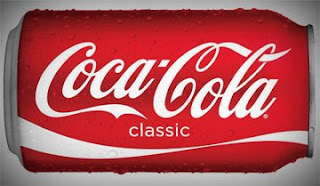
There was a time when Coca-Cola's packaging was as irritatingly fussy and over-complicated as its competitors'. No more. Coke unveiled the engagingly simple new Coca-Cola Classic can last summer, after junking the neurotic illustrations on the old cans in favor of the beautifully scripted "signature" that's been its corporate logo since the 1880s.

Really appreciate the clean, subtle and "classic" use of Gotham.
Read the whole thing over at the International Herald Tribune: Alice Rawsthorn on Quietly Good Design.
That's Right,
HMK


