Graphic and publication designer Dick Sheaff is sharing his amazing collection of ephemera along with some keen insight and history to help put things in context.


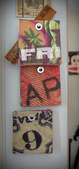
All of the above images are examples of the Gaslight Style:
"One pronounced aspect of Victorian design was a great interest in creating the illusion of depth, particularly so with lithographers. Type, vignettes, products and design elements are made to seem multi-layered through the use of shadows, superimposition, dimensional banners and ribbons, turned-up faux page corners and choice of colors.
Some have labeled this the Gaslight Style approach to design, for example Maurice Rickards: "Said to have derived from the play of lamps on three-dimensional street lettering, i.e. storefront signage, etc. The style appears to have originated in Germany, spreading, through the influence of German printing skills, throughout the world."
Chief features of the style are heavily three-dimensional lettering with a vigorous rendering of tonal gradation and shadow effects. A characteristic treatment involved the use of a vignetted 'cloud-work' background against which lettering appeared in lighter tone, with heavy shadowing to hold outlines where these overlapped on to plain paper. A wealth of heavy scroll- and strap-work, also rendered in three dimensions, filled in the interstices of the design.
The style, for which at the time no specific name emerged, is thought to have been inspired by the chiaroscuro effects of gas lighting, and has subsequently received the designation Gaslight Style."
And while you're there, don't miss Mr. Sheaff's little side collection of People Holding Fish!
That's Right,
HMK
Big Gracias to Eric Baker over at Design Observer.