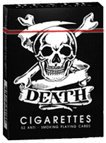
It is early winter, 1894, and a young woman, a servant to a prosperous New York family, finds herself in need of immediate medical attention. Poor and illiterate, she takes it upon herself to seek a remedy for her discomfort by scanning the shelves of her employers’ pantry, where she spies a bottle whose label features a skull and crossbones. Unknowingly, she downs a swig or two, whereupon she collapses in agony and is rushed to the hospital. Miraculously, she survives, later telling the police that she selected this particular bottle because of the picture on the label — a picture of bones. “I thought it would heal my aching limbs,” she confesses. “I had no idea it was poison.”
A true story. And blessedly, we've come a long way since then. But the notion of truth-telling on a label remains a tricky enterprise. In the United States, regulatory commissions like the Food and Drug Administration require warnings and printed counterindications to alert consumers not only to potential sources of poison, but to other possible dangers related to food, medicine and cosmetics, among other things. There's a no-nonsense specificity to such literature, leaving no wiggle room, no space for interpretation.
In this context, the role for design — and by this I mean the introduction of what might well be more persuasive visual and verbal solutions for critical warning information — remains fundamentally restricted by what is, in the end, legally permissable.
CONTINUE READING THIS ARTICLE >>
Thanks to Jessica Helfand at The Design Observer.
Reading Jessica Helfand's article reminded me of a little blurb I read in Readers Digest back in the 80's. It was about an Asian family that had just moved to the US and were grocery shopping for the first time.
They were suprised to find that the big can of Crisco they purchased did not contain the 10+ peices of fried chicken that were pictured on the lable.
Hardly.
That's Right,
HMK


No comments:
Post a Comment