Sunday, February 08, 2009

Designing the Future of Business

Tubebot 002: Off Balance

"Forget total quality. Forget top-down strategy. Design is the engine that can transform a company into a powerhouse of nonstop innovation."

"Imagine a crazy wonderland where most of what you learned in business school is either upside down or backward. A land where customers control the company, jobs are avenues of self-expression, the barriers to competition are out of your control, strangers design your products, fewer features are better, advertising drives customers away, demographics are beside the point, whatever you sell you take back, and best practices are obsolete at birth. Meaning talks, money walks, and stability is fantasy. Talent trumps obedience, imagination beats knowledge, and empathy trounces logic.

If you've been paying close attention, you don't have to imagine this scenario. You see it forming all around you. The only question is whether you can change your business, your brand, and your thinking fast enough to take full advantage of it."

Great stuff from Marty Neumeier, president of San Francisco think tank Neutron and author of Zag and The Brand Gap. His latest book, The Designful Company, considers the challenge of building a corporate culture of innovation.

More: Designing the Future of Business

That's Right,

HMK

Saturday, February 07, 2009

Gerd Arntz


This is a great reference for those of us who are forever looking to simplify and communicate instantly.

In the interest of simplification, Gerd Arntz (1900-1988), commissioned by Otto Neurath, developed the Isotype visual dictionary. The idea was that images can bridge differences of language, are easy to grasp and, when done well, also nice to look at.

The International System Of Typographic Picture Education was developed by the Viennese social scientist and philosopher Otto Neurath (1882-1945) as a method for visual statistics.

Gerd Arntz was the designer tasked with making Isotypes, pictograms and visual signs. Eventually, Arntz designed around 4000 such signs, which symbolized keydata from industry, demographics, politics and economy.

The legibility of Isotype is determined by the simplicity of its symbols. These should be instantly recognizable,without any distracting detail. What counts is the general idea – for common use the precise details are of less importance. Or in Neurath’swords: ‘It is better to remember simplified images, than to forget exact figures.’


Above is a 1930’s linoleum-cut and print proof of an Isotype symbol by Gerd Arntz from the Arntz archive, now at the Municipal Museum, The Hague. The original linos show the precision of the craft work in the expressive traces of the gouge. Photo: Max Bruinsma


Gerd Arntz draws the Isotype symbol for 'unemployed'.

Do yourself a favor and bookmark this as an insightful and handy reference tool complete with some really nice detailed history along with the 4000+ isotypes over at the Gerd Arntz Web Archive.

That's Right,

HMK

Thursday, February 05, 2009

Old Booth Rules!

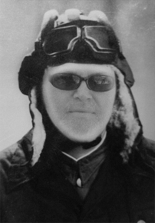
HMK Polar Explorer

That's Right, that's me created with Old Booth using the original photo below.

Old Booth is an amazingly addictive photo manipulation iPhone app that provides a seriously funny and most intuitively wicked simple GUI that'll have you and everyone looking at your screen laughing out loud in no time!

Designed, programmed and created by Arkadiusz Młynarczyk and Piotr Bialkowski, 2 of the 5 Polish Geniuses over at 2Pixels...

Polish Geniuses you say? Yes! More on these guys later...

Go to the iTunes App store and download your free version right now or grab it from the 2Pixels site!

And when you're done, add your favorites to my Old Booth Rules! group over at flickr!


The awesome Old Booth icon was designed by the amazing Pejot.

HMK Castaway Caveman Spurs Fan

And, just because I love my Spurs, I'm not shaving until coach Popovich does...


Go Spurs!

That's Right,

HMK

Thanks to Brian Parrish for the HMK shot and These Guys for the Greg Popovich Image:

Wednesday, February 04, 2009

Lego Camera


Lego is producing a wide range of branded gadgets these days ranging from video cameras, MP3 players and walkie talkies to boom boxes and radio alarms.

Love this camera. Check out more: Lego.

That's Right,

HMK

Thanks to Retro To Go

Monday, February 02, 2009

Steelmark to Steelers


History & Origin of the Pittsburgh Steelers Logo

The six time Super Bowl Champion Pittsburgh Steelers have not always been the Steelers. Originally founded as the Pittsburgh Pirates by Arthur (Art) Joseph Rooney on July 8, 1933, the Steelers changed their name in 1940 in an attempt to generate some fan support and involvement. Fans were encouraged to send their suggestions to the team; several nominated the winning name Steelers to reflect the city's primary source of employment, winning season tickets for their suggestion.

The colors were originally chosen to promote the attributes for steel: yellow lightens your work; orange brightens your leisure; and blue widens your world. The logo's color concept was later amended to represent the three materials used to produce steel: yellow for coal; orange for iron ore; and blue for steel scrap.

Check out the full article by Albrecht Powell: History & Origin of the Pittsburgh Steelers Logo.

And did you know that those three diamonds enclosed within the circle are technically know as hypocycloids - diamonds with inward-curving edges? Now you do!

Great game last night!

That's Right,

Gracias to the Michael Bierut over at Design Observer.

HMK

Thursday, January 29, 2009

Bohlin Cywinski Jackson Architects


Man - just look at this place! What an amazingly hip and modern abode. Feast your eyes on the Woodway Residence in Washington, by Bohlin Cywinski Jackson.

Founded in 1965, Bohlin Cywinski Jackson, has offices in Wilkes-Barre, Pittsburgh, Philadelphia, Seattle and San Francisco. The firm’s work is known for exceptional design, for its commitment to the particularity of place and user, and for an extraordinary aesthetic based on a quiet rigor which is both intellectual and intuitive.

The firm’s work ranges greatly in scale and circumstance. Its architecture is alive to the subtleties of place — man-made or natural, to the varied natures of people, to the sensibilities of individuals, to the character of institutions, and to the rich possibilities of materials and the means of construction.

Bohlin Cywinski Jackson has received more than 370 regional, national and international awards for design. In 1994, the practice received the Architecture Firm Award from the American Institute of Architects. The firm’s work is published regularly in professional journals worldwide.

That's Right,

HMK

Thanks to Design Milk and Bohlin Cywinski Jackson.

Wednesday, January 28, 2009

Things You Never Noticed In Famous Pictures


The above was brilliantly conceived by oball. Read his About: oball!

Genius! That's just good comedy folks!

Back during my sophomore year of high school I actually subscribed to both Mad and Cracked Magazine at the same time for a year back in the late 70's.

Check out more Things You Never Noticed In Famous Pictures from the still relevant, (Since 1958!) and totally funny as hell Cracked Magazine!

That's Right,

HMK

Tuesday, January 27, 2009

Giant Color Pencils


This made me smile. Finnish artist Jonna Pohjalainen created Color Pencils during an environmental art workshop at the Open-Air Art Museum in Pedvale.

Nice.

More info: Environmental Art.

That's Right,

HMK

Thanks to Guerrilla Innovation.

Monday, January 26, 2009

Sneak Peaks


The cool and smart folks over at Design Sponge have a really nice and inspiring section of their site aptly tiled Sneak Peaks. The above images are Sneak Peaks from the interiors of Sulu Design (above), Brave Space Design and Louise Fili (below).


Nice stuff!

That's Right,

HMK

Friday, January 23, 2009

I Ordered a Pie and Got A Cupcake!

Pizza according to Ciao La Vanderia...

Welcome to Ciao Lavanderia in Olmos Park, home of the 3 Bite Slice!

Wow. Thrilling. A bit of cheese and tomato on the first bite and then just crust.

Seriously, since when is a 7" pizza considered a large pizza?

What happened Ciao Lavanderia? You guys used to be friendly, generous and fun - now, unfortunately, you're just another eatery resting on your laurels wondering why your dining room is empty at 7:30 on a Thurday night...

Last night I called Ciao Lavanderia ahead of time and inquired about whether or not a large Margarita Pie would be enough for two adults - "Oh yes, it's 8 pieces and should be plenty" was the reply. Cool. We stopped at Don's & Ben's on Mc Cullough and got a bottle of red to take home with our dinner. (Don's & Ben's, by the way, not only has an awesome friendly staff - they've also got wine tasting on Thursday, Friday and Saturdays!)

We've eaten at Ciao a several times in the past and it's been really great so we decided try their pizza.

When I arrived to pick up my pie I felt like I was being Punk'd! I opened the tiny box and looked at the dinky and sparcely built Easy Bake Oven pizza inside and said -"You're kidding, right - you guys told me on the phone that this would easily feed two adults." "Sorry sir, that is our large pizza" he said taking my credit card.
I looked around the empty restaurant (suprise!) paid and left.

The condescending attitude from both the waiter and the manager after I called back only made things worse.

We live in Monte Vista, about a quarter of a mile from Ciao in Olmos Park, and decided to support the neighborhood only to be deceived by the staff and irritated by a manager who couldn't care less.

Had I not called ahead this would not have been such a big deal. The problem is that I did call ahead and was basically lied to. I ordered a pie and got a cupcake. Great place to eat if you're not hungry, like to waste money all while being treated like crap!

Ciao, as in goodbye indeed - another one bites the crust!

From now on, well stick with our old reliables like Pizza Volare, Florio's, Sorrento and Pizza Classic!

That's Right,

HMK

Thursday, January 22, 2009

Got Wood?


Dang! How sweet is this! Check out Portuguese craftsman Carlos Alberto's hand built Wooden Vespa!

That's Right,

HMK

Thanks to Makezine.

Tuesday, January 20, 2009

Tickets To A Better Tomorrow


The inauguration of the president and vice president of the United States is a ceremonial tradition which dates back to George Washington, representing a peaceful transfer of power from one individual to another.

Above, the 1933 Roosevelt-Garner Inauguration Ticket, part of a collection of Inaugural ephemera from the Office of Senate Curator's Inaugural Collection. There's also inaugural programs, inaugural luncheon menus and programs, floor plans and seating charts, badges, ribbons, press credentials, historic engravings, and photographs.

I love this black and white wood engraving of the Inauguration of President Lincoln, in front of our Capitol, at Washington, D.C., still under construction.

May God Bless President Obama and the USA. And may God Bless us all and give us the faith, strength and courage to face the challenges before us. Here's to a better world, a better life and better tomorrow for all of us here on the good earth!

Peace!

That's Right,

HMK

Monday, January 19, 2009

Retro Records Vinyl Flashback


If you're like me and you're instantly attracted to the above record sleeve images, courtesy of El Estratografico, then you'll really dig the 9,000+ images over at the Retro Records Pool!

That's Right,

HMK

Thanks to the Easy Dreamers...

Lect Up Lenses


Nice Photoshop work from photographers Ilario & Magali and llustrator La souris sur le gâteau for French agency Callegari Berville Grey.

That's Right,

HMK

Thanks Freddie!

Saturday, January 17, 2009

Eye Yi Yi!


Feast your eye on this and behold - The Far Side Flickr Pool.

A flickr group where you can view and upload photographic recreations of your favorite Gary Larson Far Side comics.

That's Right,

HMK

Big gracias to flickr and The Rocketeer for the cool shot.

Thursday, January 15, 2009

Murphy's Graphic Design Laws


Creative inspiration flows in inverse proportion to the distance from the studio.


Ain't that the truth! Just one of Graphic Design Laws from the smart folks over at Murphy's Graphic Design Laws.

Might be a nice campaign for Murphy's...

That's Right,

HMK

Thanks to Murphy, Swiss Miss, Sara and D. Keith Robinson for the fine shot.

Wednesday, January 14, 2009

HMK on CNN

HMK CNN
Wow! Check out my first CNN interview!

Who woulda thunk that my first shot with mass exposure would be from my iPhone?

HMK CNN.

Crazy...

That's Right,

HMK

Number 9... Number 9...

HMK Mystery Stream 01.09.2009
Check out the latest HMK Mystery Stream Podcast!

Cheers and here's to making it through this next year!

Search HMK in iTunes & subscribe or Click Hear: HMK Mystery Stream!

Officially posted on 01.09.09 at 9:09 of course...

Make It Louder!

Migwell

Monday, January 12, 2009

Absolutely Craptastic!


Introducing Microsoft's Songsmith. Seriously, WTF?

And that's not all folks! If you think that's bad, check out David Lee Roth's version of Running With The Devil using Microsoft's Songsmith...

That's Right,

HMK

Sunday, January 11, 2009

Standing On The Brink

iF: Special Episode Satisfaction Guaranteed

Even if you don't know much about the economy, you've probably noticed that something went horribly wrong in 2008. And 2009 doesn't look much better. Design Observer's Michael Bierut has been working as a designer for over 28 years, and depending on how you count, this is either his fourth or fifth recession. He's got some words of wisdom and advice regarding what happens, and a few things you can do about it.

From Designing Through the Recession:

"The modern design studio can't help but subscribe to the cult of asap. But while working at full speed is great for profit margins, it's not so good for quality control. A design solution almost always benefits from a second, third or fourth look.

Take advantage of the slower pace of a recession by remembering what it was like in design school to spend a full semester on a single project. What seemed then like torture may now feel like a luxury, and your work will benefit. And don't forget that recessions are a great time for the kind of research and development that manifests itself in self-initiated projects, work that takes a longer view than the next deadline."

As Michael Cannell writes in today's New York Times, "However dark the economic picture, it will most likely cause designers to shift their attention from consumer products to the more pressing needs of infrastructure, housing, city planning, transit and energy. Designers are good at coming up with new ways of looking at complex problems." In the same article, Cranbrook's Reed Kroloff agrees, saying we could be "standing on the brink of one of the most productive periods of design ever."

You might be thinking that most of this article is easier said than done. I can personally attest that it's not easy, but it's totally doable! It's simply a matter of downsizing and focusing on what you really and truly want to achieve and at the same time eliminating all the stuff you'll probably never even miss once you get rid of it!

When I moved back to Texas from Boston back in 1991 I had a 14K Visa balance, basically an extension of my student loan to Massachusetts College of Art. The first thing I did was bite the bullet, put my VW Bug on blocks and rode my bike to work for the next 2 years until I was free and clear of that debt. It was sucky at first, especially when it rained but I did it.

Then, fast-forward to 2007 after getting let go from my advertising gig almost two years ago, the first thing I did was, that's right, cut my overhead. We canceled Netflix and magazine subscriptions, killed our landline, downgraded cable, use more blankets in the winter, clip coupons, etc. Heck, I even sold my car! All the while doing anything and everything possible to "keep the lights on".

As a result, my family and friends are spending more quality time together taking turns working on each others house projects, exercising, taking longer walks around the neighborhood with the dogs, cooking big meals together, playing Scrabble and Texas Hold'em, and simply slowing down and just hanging out.

As of today, I'm currently smack dab in the middle of a re-fi, lowering my rate from 7% to about 5% saving us close to $400 a month! We've been a one car family for over 2 years and for the most part completely solvent - broke, but solvent! So far, so good - even after my brief bout of cancer in 2008 with no health insurance (thus wiping out my savings) I'm feeling super blessed and lucky, free and clear and simply happy to be here!

What we all really need to do is to think of this as a opportunity to get back to basics. And like the article says - Ask yourself: what do I really need to do my work? Then get rid of everything else. It's really that simple. Sure, 2009 is going to be rough for most everyone I know, but with a little frugality and an earnest back to basics mindset it's amazing how little we actually need to survive. You can do it!

Good smart stuff - read on: Designing Through the Recession.

Happy New Year and Good Luck!

That's Right,

HMK
Friday, January 09, 2009

One in 8 Million


Above: Meet Joel Karp: The Corner Druggest
This is really nice. Like most cities on planet earth, each one is a city of stories, a parade of people with something to say. One in 8 Million is a collection of passions and problems, relationships and routines, vocations and obsessions from some of the folks that make New York New York.

I'm really looking forward to checking out the weekly additions to these roughly 2 and a half minute segments.

If you love real people you'll love this. New York Characters in Sound and Images.

That's Right,

HMK

Thursday, January 08, 2009

The Just-Right Desk


Penelope Green, a reporter for the New York Times Home section, set out with a budget of $1,000 to try a number of new and old desks, seeking professional advice along the way.

Blu Dot's Desk 51 above was named after Area 51, the Nevada military base beloved by UFO conspiracy theorists, because the designers thought it looked "alienish." One feng shui expert called its color "super yang."

I''ll be doing the exact same thing within the next month or so but with about half the budget - stay tuned for my results. Meanwhile, check out In Search of the Just-Right Desk.

That's Right,

HMK

Wednesday, January 07, 2009

Frankie's


Wow, I just might have to move Vegas closer to the top of my list of places to visit before I die.

I've never been, nor have I ever had any real desire to visit Las Vegas. But I must admit that Frankie's Tiki Room looks and sounds like a pretty cool place. Really digging the mug selection!


It's funny. Whenever I hear anyone talk about their wildly decadent trip to Las Vegas (having been lucky enough to visit Monoco, Atlantic City and the capital of Holland a good half a dozen times), I'm always reminded of this bumper sticker I spotted on a POS AMC Pacer up in Austin a few years back which read: AMSTERDAM. Vegas Is For Pussies. Enough said.

Check it out: Frankie's Tiki Room.

That's Right,

HMK

Big Gracias to NotCot.

Friday, December 26, 2008