Saturday, February 28, 2009
Le Answer Vinyl iF: Episode 103
That's Right, check out the latest HMK Mystery Stream Podcast, IF: Irregular Frequency Episode 103.
Launch Now in iTunes!
Captured from the continual mystery stream discovered in the fall of 1961, our mission is to post 60+ minute fragments, as frequently or infrequently as possible, from this not too distant satellite of unknown origion presumed to be located somewhere near the dark side of the moon.
Here's some of what you can expect: Haze-laden static free audio explorations featuring snippets of vaguely familiar audio clues to both your past and future, along with intriguing whispered transmissions of promise via an experimental format known as iF: Irregular Frequency.
Relax and clear your mind. Consider the HMK Mystery Stream as your own personal soundtrack experiment - your personal out-of-body, in-flight entertainment for the next sixty minutes of you life.
The seemingly random sonic segues and hand selected audio transmissions are designed to expedite your personal escape to your own alternative reality. Moving in stereo, in our continuing attempt to gain a more clear and deeper understanding of the infinite concept of space and time fueled by the atmospheric vibrations and soundscapes known as The HMK Mystery Stream.
One can only listen, dream, imagine and repeat whenever possible. As your landscape, mood and sense of reality change, so changes the impact, meaning and relevance of your soundtrack.
Well folks, the captain has turned on the Fresh Coffee sign. Please put your headphones on and prepare for lift off... Roger that... Go with bottle up... Remember: Nothing Is Real Until It Is Shared.
As always your comments are always welcome and appreciated.
Launch Now in iTunes or Click Hear: hmk.podomatic.com to stream.
Make It Louder!
That's Right,
HMK
Black Magic Vino
Very nice work from the smart folks down-under at M|A|S|H in Australia.
This limited edition wine represents the best of the Small Gully range and a wine personally developed by the mysterious Mr. Black AKA Stephen Black. The concept was to produce a simple hand written, almost home made package, as if the wine maker had scratched the details of the wine into the bottle himself.
A beautiful imported glass bottle was chosen that Mash then had laser etched. The words actually cut into the surface of the glass giving a great tactile and very raw feel. Something that screen printing could not achieve. The result was a cross between contemporary luxury and personalized roughness.
Makes me thirsty...
That's Right,
HMK
Gracias to Joachim Baan at Anothercompany.
Labels:
australia,
black magic,
etched,
homemade,
luxury,
smart,
type retro,
typography,
vino,
wine
Beam Me Down Scottex
Digging the image for this nice ad for Scottex via Agency Duval Guillaume in Antwerp, Belgium.
That's Right,
HMK
Gracias: Freddie!
Labels:
Ad,
Antwerp,
europe,
photography,
street,
toilet paper
Friday, February 27, 2009
The End Is Neigh!
C'est la Fin de "La Marie du Port" de Marcel Carné ... 1949
Ok, start the HMK Wake Slideshow!
Man I love flickr!
Now that that's finally out of the way I can focus on the soundtrack...
That's Right,
HMK
Thanks to BlueSuddenSubway for the great FIN image!
Wednesday, February 25, 2009
Warning: Watchmen Spoiler!
Sweet - I just found out we've got sneak preview tickets to see Watchmen this Monday, March 2 thanks to Jackie and his lovely wife Amelia!
Watchmen officially hits theatres Friday March 6th!
And yeah, I've totally got Watchmen on the brain because the first thing I thought of when I saw this was Rorschach!
Anyway, this is genius:
Tired of having your food stolen by sticky-fingered coworkers or roommates?
Bullies taking your kid's lunch?
Well, worry no more . . . Anti-Theft Lunch Bags are sandwich bags that have green splotches printed on both sides, making your freshly prepared lunch look spoiled. Don't suffer the injustice of having your sandwich stolen again!
Protect your lunch with Anti-Theft Lunch Bags.
That's Right,
HMK
Thanks to thanks to Design Observer.
Monday, February 23, 2009
And The Winner Is...
Don't get me wrong, I love a good movie, but marathon award ceremonies?
Yawn.
The way I look at it, why waste an entire evening watching an award show celebrating movies you've never seen when you can spend that time more wisely watching movies that nobody ever wanted to see?
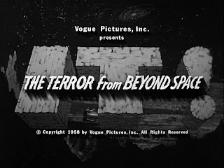
The above titles are just a few of my favorites classics that I'm pretty sure will probably never make it to Netflix - and that's really a bummer! If you've never seen the original 1943 Batman or the incredible Eegah from 1962, well, what are you waiting for?
Lots more ideas for your classic movie wish list thanks to Mr. Bali Hai!
I'll weigh in on Mr. Keith Ledger's performance as soon as I see it and I can't wait to finally see Milk though -congrats to the one of my all time favorites the amazing Sean Penn!
That's Right,
HMK
Labels:
bad movies,
Batman,
eegah,
IT,
Mr. Bali Hai,
Netflix,
Sean Penn
Wednesday, February 18, 2009
Nice Entrance!
You just gotta love the entrance way to this UK Guitar Store thanks to Hey Mr. Glen!
That's Right,
HMK
Tuesday, February 17, 2009
A Million Dollars In Every Pot!
Ok, let me get this straight - I think I might have a solution to this economic crisis we've gotten ourselves into.
Today, President Obama signed a $787 billion dollar stimulus package bill, with the goal of creating 3.5 million jobs and help pull the U.S. out of one of the worst recessions in generations.
Ok, so if it takes one thousand millions to make a billion and the U.S. population is about 300 million - why not just give every American citizen 1 million dollars?
Seriously!
Take 1 billion out of the 787, give everyone 1 million, and we still have 700 million in change.
Not only would everyone be happy and willing to both spend and save - heck - we'd still have $786+ in today's signed package!
Think about it. Why the hell not?
Oh crap, I think my math is wrong... never mind...
That's Right,
HMK
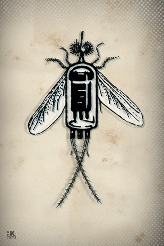
DieFabrik Storage System
I'm digging the simplicity of this hip and smart interlocking storage system from the folks at DieFabrik in Germany.
"Sehr schön - ich will das für unser Haus!"
That's Right,
HMK
Monday, February 16, 2009
Octopus Jewelry Made from Real Octopus!
Dig this super hip octopus jewelry made from real sushi grade octopus!
Life on earth began in the Sea. Organisms from every major group can still be linked to those underwater. These beautiful and amazing creatures should be honored and celebrated...
The Octopus is a symbol of Transformation and Regeneration. Because of its reputation of changing colors to match its backgrounds, the octopus is also known as the Master of Disguise.
Octopuses also have the power to regenerate. If an octopus loses an arm in battle it can grow a new one. Some can even detach and arm to distract predators and then grow another!
Don't mess with the octopus because they can stun or kill you with one poisonous bite. The poison is called tetrodotoxin which is the same as Fugu, the puffer fish served in Japan.
So treat your Octopus with Love!
The octopus used in the OctopusMe jewelry is sushi grade. Items have been hand cast in Sterling Silver unless specified otherwise .
Check it out over at the always hip Esty!
That's Right,
HMK
Thanks to Design Milk.
Friday, February 13, 2009
Unix Time!
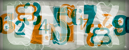
Dig this - as of 6:31:30PM ET this afternoon it'll officially be 1234567890 Unix time!
Unix time started at zero on midnight January 1, 1970 and has been counting seconds ever since, not counting leap seconds.
Tune in on December 22, 2282 at 3:13:30PM ET as we ring in 9876543210!
That's Right on time,
HMK
Thanks to the Wired Blog
Thursday, February 12, 2009
Trés Bon!
Bonjour! Did you know that the 100 year old Michelin man's real name is Monsieur Bibendum?
Now you do!
Check out 25 Random Things about Graphic Design from Tishon's Design+Writing=Blog.
That's Right,
HMK
Thanks to Michael Bierut over at the Design Observer.
Wednesday, February 11, 2009
Man Gains Right to Art Confiscated by Gestapo
Wow. It's kind of humbling when you consider how far we've come as a species.
This is truly an amazing story to me.
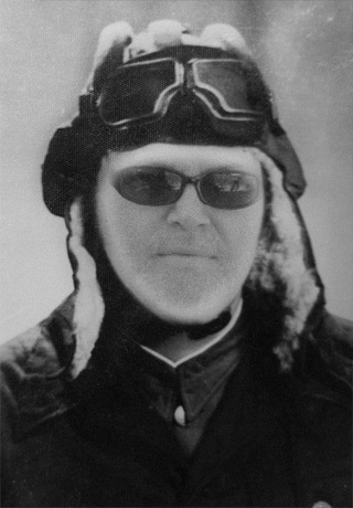
BERLIN, Feb. 10 -- A court ruled Tuesday in favor of a Florida man seeking the return of his family's collection of rare art posters, worth an estimated $6 million, more than 70 years after the works were confiscated by the Gestapo and then given to a German museum.
Peter Sachs, a retired airline pilot from Sarasota, Fla., had sued the German Historical Museum in Berlin for custody of at least 4,200 rare posters depicting movies, cabaret shows and political propaganda from the early 20th century. The collection had been assembled by his father, Hans Sachs, a Jewish dentist who fled Germany in 1938.
Continue Reading: Man Gains Right to Art Confiscated by Gestapo.
I can't wait for the movie and the book archiving the posters!
That's Right,
HMK
Thanks to the Washington Post Foreign Services' Craig Whitlock.
Tuesday, February 10, 2009
Coffee Smarts
Talk about perfect timing!
Thanks to the good folks over at Consumer Reports, we can all be frugal without sacrificing taste and save 5.25 per pound on 100% Colombian Coffee!
Consumer Reports coffee experts taste tested 19 ground coffees and deemed the $6.28 per pound Eight O'Clock Coffee 100 Percent Colombian a complex blend of earthy and fruity coffee, with a bright, pleasing sourness.
Compare that to Starbucks Coffee Colombia Medium, $11.53 per pound, which didn't even place among the top regular coffees.
That's Right,
HMK
Thanks to the smart coffee loving folks at Ad Pulp.
Thanks to the good folks over at Consumer Reports, we can all be frugal without sacrificing taste and save 5.25 per pound on 100% Colombian Coffee!
Consumer Reports coffee experts taste tested 19 ground coffees and deemed the $6.28 per pound Eight O'Clock Coffee 100 Percent Colombian a complex blend of earthy and fruity coffee, with a bright, pleasing sourness.
Compare that to Starbucks Coffee Colombia Medium, $11.53 per pound, which didn't even place among the top regular coffees.
That's Right,
HMK
Thanks to the smart coffee loving folks at Ad Pulp.
The Greatest Motivational Poster Ever?
"Millions of copies of the "Keep Calm and Carry On" poster were printed on the eve of World War II, but never displayed. Now the message has taken on a new lease of life in our troubled peacetime.
The simple five-word message is the very model of British restraint and stiff upper lip. Keep calm and carry on.
In 1939, with war against Germany looming, the Government designed three posters to steady the public's resolve and maintain morale. These featured the crown of King George VI set against a bold red background, and three distinctive slogans - "Freedom is in Peril", "Your Courage, Your Cheerfulness, Your Resolution Will Bring Us Victory", and "Keep Calm and Carry On".
Two-and-a-half million copies of "Keep Calm" were printed, to be distributed in the event of a national catastrophe, but remained in storage throughout the war.
The message was all but forgotten until 2000, when a copy was discovered in a box of books bought at auction by Stuart Manley, a bookseller from Northumberland."
Read the rest of Stuart Hughes' The Greatest Motivational Poster Ever? for the BBC News Magazine.
That's Right,
HMK
Monday, February 09, 2009
Modern Chalkboards
These are pretty sweet. Made from reclaimed wood these eco-friendly modern chalkboards from Kotona come in a variety of sizes and colors.
Check them out over at Matteria.
That's Right,
HMK
Thanks to Design Milk.
Watchmen 03.06.09
Sunday, February 08, 2009
Designing the Future of Business
"Forget total quality. Forget top-down strategy. Design is the engine that can transform a company into a powerhouse of nonstop innovation."
"Imagine a crazy wonderland where most of what you learned in business school is either upside down or backward. A land where customers control the company, jobs are avenues of self-expression, the barriers to competition are out of your control, strangers design your products, fewer features are better, advertising drives customers away, demographics are beside the point, whatever you sell you take back, and best practices are obsolete at birth. Meaning talks, money walks, and stability is fantasy. Talent trumps obedience, imagination beats knowledge, and empathy trounces logic.
If you've been paying close attention, you don't have to imagine this scenario. You see it forming all around you. The only question is whether you can change your business, your brand, and your thinking fast enough to take full advantage of it."
Great stuff from Marty Neumeier, president of San Francisco think tank Neutron and author of Zag and The Brand Gap. His latest book, The Designful Company, considers the challenge of building a corporate culture of innovation.
More: Designing the Future of Business
That's Right,
HMK
Saturday, February 07, 2009
Gerd Arntz
This is a great reference for those of us who are forever looking to simplify and communicate instantly.
In the interest of simplification, Gerd Arntz (1900-1988), commissioned by Otto Neurath, developed the Isotype visual dictionary. The idea was that images can bridge differences of language, are easy to grasp and, when done well, also nice to look at.
The International System Of Typographic Picture Education was developed by the Viennese social scientist and philosopher Otto Neurath (1882-1945) as a method for visual statistics.
Gerd Arntz was the designer tasked with making Isotypes, pictograms and visual signs. Eventually, Arntz designed around 4000 such signs, which symbolized keydata from industry, demographics, politics and economy.
The legibility of Isotype is determined by the simplicity of its symbols. These should be instantly recognizable,without any distracting detail. What counts is the general idea – for common use the precise details are of less importance. Or in Neurath’swords: ‘It is better to remember simplified images, than to forget exact figures.’
Above is a 1930’s linoleum-cut and print proof of an Isotype symbol by Gerd Arntz from the Arntz archive, now at the Municipal Museum, The Hague. The original linos show the precision of the craft work in the expressive traces of the gouge. Photo: Max Bruinsma
Gerd Arntz draws the Isotype symbol for 'unemployed'.
Do yourself a favor and bookmark this as an insightful and handy reference tool complete with some really nice detailed history along with the 4000+ isotypes over at the Gerd Arntz Web Archive.
That's Right,
HMK
Thursday, February 05, 2009
Old Booth Rules!
That's Right, that's me created with Old Booth using the original photo below.
Old Booth is an amazingly addictive photo manipulation iPhone app that provides a seriously funny and most intuitively wicked simple GUI that'll have you and everyone looking at your screen laughing out loud in no time!
Designed, programmed and created by Arkadiusz Młynarczyk and Piotr Bialkowski, 2 of the 5 Polish Geniuses over at 2Pixels...
Polish Geniuses you say? Yes! More on these guys later...
Go to the iTunes App store and download your free version right now or grab it from the 2Pixels site!
And when you're done, add your favorites to my Old Booth Rules! group over at flickr!
The awesome Old Booth icon was designed by the amazing Pejot.
And, just because I love my Spurs, I'm not shaving until coach Popovich does...
Go Spurs!
That's Right,
HMK
Thanks to Brian Parrish for the HMK shot and These Guys for the Greg Popovich Image:
Wednesday, February 04, 2009
Lego Camera
Lego is producing a wide range of branded gadgets these days ranging from video cameras, MP3 players and walkie talkies to boom boxes and radio alarms.
Love this camera. Check out more: Lego.
That's Right,
HMK
Thanks to Retro To Go
Monday, February 02, 2009
Steelmark to Steelers
History & Origin of the Pittsburgh Steelers Logo
The six time Super Bowl Champion Pittsburgh Steelers have not always been the Steelers. Originally founded as the Pittsburgh Pirates by Arthur (Art) Joseph Rooney on July 8, 1933, the Steelers changed their name in 1940 in an attempt to generate some fan support and involvement. Fans were encouraged to send their suggestions to the team; several nominated the winning name Steelers to reflect the city's primary source of employment, winning season tickets for their suggestion.
The colors were originally chosen to promote the attributes for steel: yellow lightens your work; orange brightens your leisure; and blue widens your world. The logo's color concept was later amended to represent the three materials used to produce steel: yellow for coal; orange for iron ore; and blue for steel scrap.
Check out the full article by Albrecht Powell: History & Origin of the Pittsburgh Steelers Logo.
And did you know that those three diamonds enclosed within the circle are technically know as hypocycloids - diamonds with inward-curving edges? Now you do!
Great game last night!
That's Right,
Gracias to the Michael Bierut over at Design Observer.
HMK
Subscribe to:
Posts (Atom)